Screenshot / Parking Entrance
-
 07-October 19
- Views 1,487
- Fans 1
- Comments 6
-
 Description
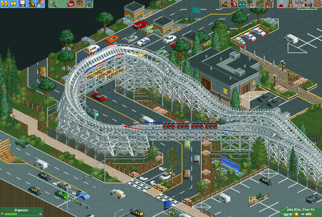
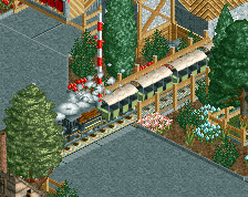
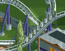
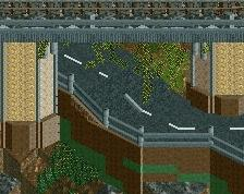
Carolina’s Adventure is the next project I’m working on. Unlike my other projects this will be a complete amusement park. This is the road entrance to the parking lot for the park. This is heavily inspired by the SFGA entrance. Would love to hear any suggestions y’all have on this! :)
-
 Full-Size
-
1 fan
 Fans of this screenshot
-
 Tags
Tags
![screen_137_[Holding] Concrete Jungle #2/3](https://www.nedesigns.com/uploads/screens/137/137_thumb.png)
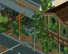
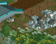
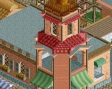
I also added a Dollar General that sits right next to the coaster.
Attached Thumbnails
Cool stuff, a classic out'n back woodie is always a nice border to a park. I'd make sure to watch your scale and maybe try and to experiment with some different textures for your roofs and such, just to make things feel a bit more natural.
Nice! Love the coaster/parking lot interaction, really gives life to the screen. Just one thing - did you experiment with the coaster colors? I get that there is the white/red/blue theme, but an all-white woodie just looks a little too, well, white, in my eyes. Could the accent blue and reds appear in more places, or could you try making the rail/trim color grey? Or perhaps the supports could be brown? If none of that works, I still think it looks good overall as is
Love the coaster, but yea for some reason the scale seems a little off to me. I think its the car object that you used, maybe the car ride cars would have been better. Great screen regardless, would be really cool to drive under a turnaround like that to enter a parking lot in real life
Overall is great