Screenshot / New project
-
 29-September 19
-
 Disney Studios Paris
-
 1 of 6
- Views 1,768
- Fans 2
- Comments 10
-
 Description
Hey guys,
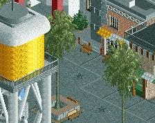
I´m finishing up on KotMaS, but to break up the tedious ´finishing work´ I started with another project. I know it´s still kinda empty without peeps and the bare surroundings, but wanted to show it to you anyways. It's not going to be a one-on-one remake of the real park, but more of a 'park largely based on the real park'. Hope you guys like it and feedback is appreciated -
 Full-Size
-
2 fans
 Fans of this screenshot
-
 Tags
Tags
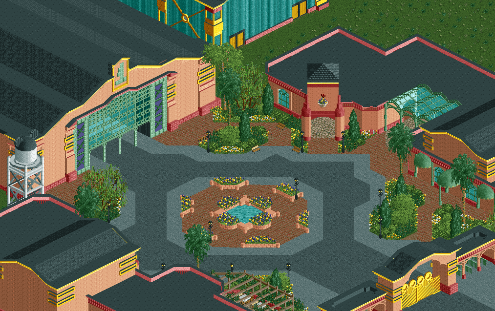
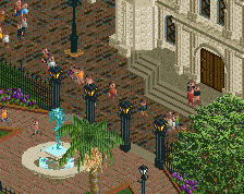
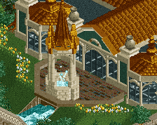
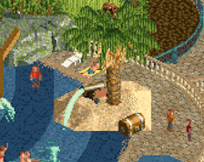
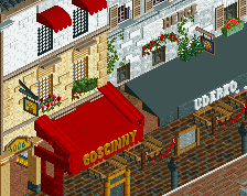
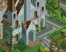
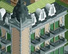
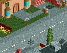
This already feels very disneyish to me, I like it. I think this could greatly benefit from things like roadlines and signs. You've got the foundations wrapped up, that's for sure. I'm a fan.
This entrance just screams Disney, keep it up.
add peeps and some more small cool details to explore for the viewer and it's awesome!
Cool start, not sure if it feels totally disney, but its quite nice. Overall the archy could probably use a bit more detail to really sell the area, especially considering thats almost the whole focus of the screen.
Could use some different wall textures/colors to break it up. Other than that its a great start. Love the shape of the plaza and the water tower. Look forward to another Disney project.
definitely some cool structures and atmosphere- but its somehow lacking life. it may be overuse of pink and the big black rooves. if you get some banners, signs/billboards/movie posters, hanging strings of lights, etc- it'll help a lot, because technically its actually pretty sound atm
I do not have this clinical eye for realism, but it is very good I liked the buildings and and the central square, the gate in yellow imitating Mikey Mouse is nice, the pink makes cool contrast with the wine color.
The water tank with detail I loved it.