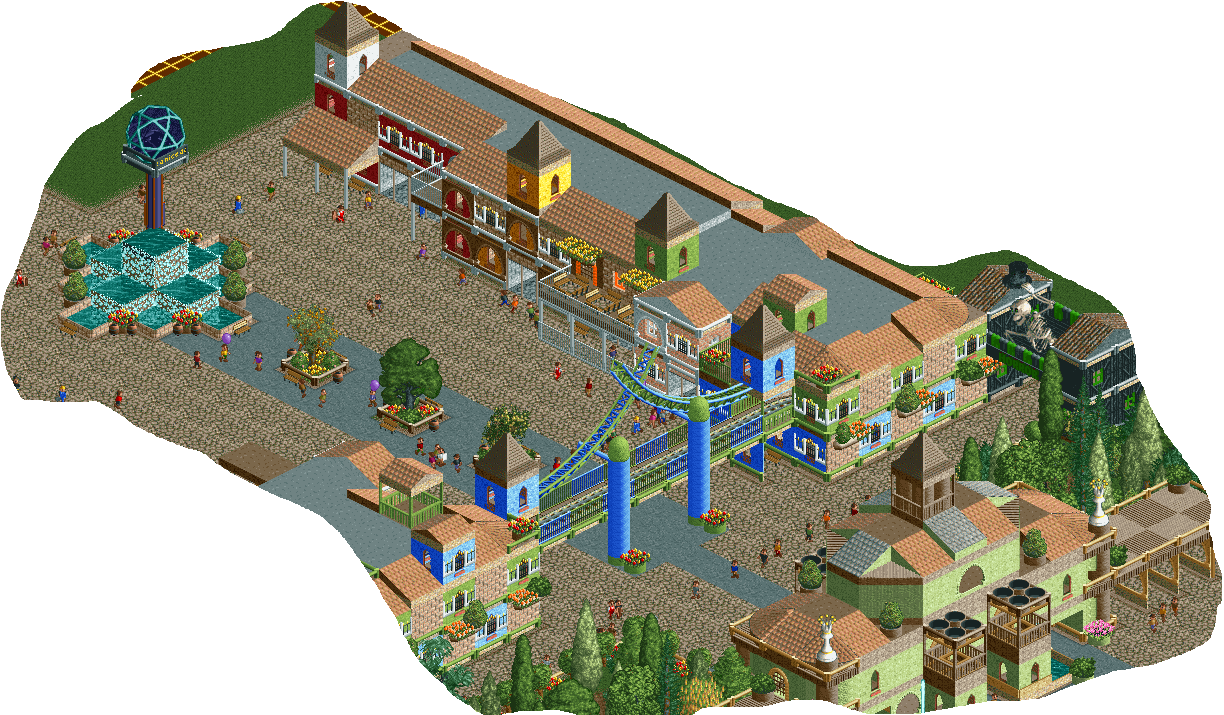
Screenshot / Right Hand Side of the Main Street
-
 15-September 19
- Views 1,628
- Fans 0
- Comments 7
-
 Description
Hello together :)
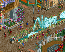
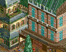
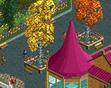
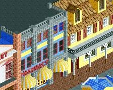
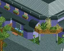
Before i went to holidays the next two weeks, i want to share an update of my park with you. The rome area isn't finished yet, but i've worked on the mainstreet. This picture shows the right part of it as well as the fountain at the end of the mainstreet.
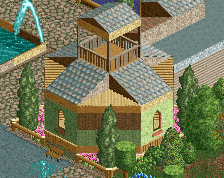
Please don't be surprised because of the black-green building, it marks the start of the Horror-Area. There will be one building for the rome, asia, space and middelage area as well in the future.
I think some details are a bit unfinished or need to be changed.
I hope you enjoy and appreciate your comments =) -
 Full-Size
-
 No fans of this screenshot
-
 Tags
Tags
Cute. Maybe could use some more planters along the sides? It's begging for some green to break up the path.
I love the use of Shrek green in this actually... it's rarely used but works really well here.
I agree about adding planters. Looks pleasant
the horror entrance looks quite hidden- not sure how well guests would find/gravitate towards it IRL. Park composure is about guiding sightlines and guest motion towards the attractions/areas/entrances you want them to see/get to
I really like this.
I do think that adding some fences on top of those shops will make the sea of grey roofing disappear.
Your style is really likeable and casual. Keep up the good work.
Very nice composition, good ideas and attention. Sadly very weak aesthetics: green vs blue vs orange vs grey.