Screenshot / Court Square
-
 02-February 14
- Views 2,044
- Fans 1
- Comments 14
-
 Description
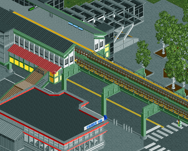
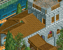
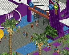
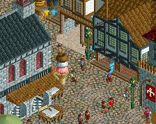
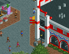
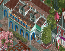
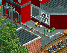
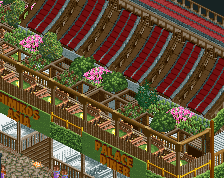
Court Square, Queens, NYC. Home to a lovely Diner, the tallest building in Queens, and 5pointz, once a haven and museum for street artists.
The first in a series of small creations showcasing some New York City locations that may or may not be famous, but hold some level of significance to me. -
 Full-Size
-
1 fan
 Fans of this screenshot
-
 Tags
Tags

Looks really nice Itm. Nice work dude.
Good, but too "replicational" for me. I'd like to see you use your own imagination more.
oh my god those railways make me think back of the game midtown madness, a racing game in the city of chicago that had open world.
as for the actual screen, woah. to think you came from something like this http://imgur.com/a/uxJNm a year ago. but seriously maybe try changing the tracks to actual track for trains
Cool recreation. Boring screen.
It's really nice to see people doing things like this. It can really improve your style and parkmaking.
I mean, working on Tokyo Dome City really helped me improve and it looks like this is doing the same for you.
Great work, really looking forward to seeing more. Great idea.
I love the Midtown Madness series, yeah now you said that it looks a lot like the railway in that game.
Love the little traffic signal.
@posix: Some future bits of this series will use a lot more imagination/creativity, don't worry.
@gdb: why did you post that here? ughh that looks so bad :/
@thirteen & faas: I'll be adding cars, and perhaps a few other details that should give it a bit more atmosphere.
@louis: When I had this idea, I thought of it as a combination of something fun (more for me than you, as the screens end up a little boring), and something that would help me improve.
@csw: it'd be better if it weren't floating. Can't really tell from this angle though.
not my fault you were using default coasters and wacky worlds stuff
Wow, this is a home run.
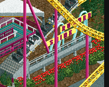
I've spent way too much time taking the subway to Yankee games and every single thing about this screams "New York City". The idea to use this track instead of the standard train track is brilliant because it really looks a lot more like the NYC subway and the way you built the support structure and the traffic light is perfect.
The only thing I call bullshit on is the road. It's perfectly paved. No road in the outer boroughs of NYC is perfectly paved.
Show me how to make potholes in RCT then.
Yeah, I spent quite a bit of time deciding on which track type to use for this. I settled on the reverser track, because it most resembles the actual subway track, but unfortunately doesn't have diagonals. If I end up doing things that have more complicated train systems, I might have to reconsider that choice.
^Not necessarily pot holes. If you look at my design Goliath, you'll see how I made my car park with different types of tarmac to suggest it had been repaved several times.