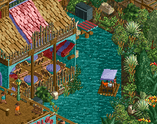
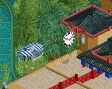
Screenshot / Kingdom of the Moon - Moonlight River and Hotel
-
 26-June 19
-
 Kingdom of the Moon and Stars
-

 4 of 5
- Views 1,612
- Fans 0
- Comments 7
-
 Description
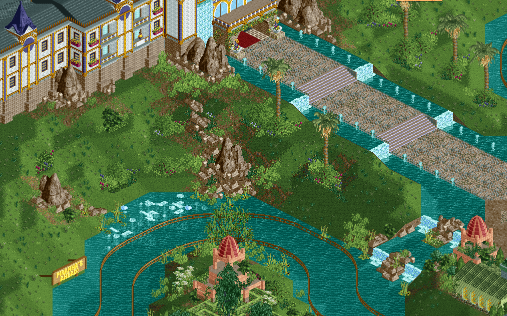
Hey Guys, I'm trying to fill in the blank spaces between the rides and the other stuff (shops/hotels etc.) and I'm struggeling to find a good balance in the amount of foliage. This part is near the entrance so I don't want to overdo it with a mayor amout of jungel, but I also don't want it to have too much open space. What do you guys think about this?
(I am going to give the main path a railing and benches/lanterns and stuff in the future) -
 Full-Size
-
 No fans of this screenshot
-
 Tags
Tags
hpg Offline
Imagine you’re the groundskeeper in a real park and think about what areas could be kept neatly trimmed and what would be left to grow more wild.
I’d go a bit more manicured closer to the main pathway where things are more accessible—especially if that’s part of the entrance. Then a little more overgrown closer to the water’s edge and maybe on some of the steeper terrain.
A little more foliage at the base of those larger buildings could go a long way too.
This actually looks sick, major improvement from your first park! I'd put some kind of fence between the path and the water though.
Great advice by hpg ^^
I'd also recommend to look up some reference images of hotels/parks and try to recreate the foliage. I understand you might not want it to look too neat and fancy, but giving it some structure might help a bit. Also some thick patches of trees would help a lot as well.
Thanks for the advice guys. This helps me a lot. I´ve added more bushes and trees and stuff and tried a lot of different mixes. I hope this is an improvement.
Attached Thumbnails
Definitely looks much better already! It still can't hurt to have a couple of thick patches of foliage where the large trees are really close together. I'd try to mix in a few more of those darker green trees close to eachother to give the area some more contrast.
Nice work!
Its looking good so far.
I really liked the building and details