Screenshot / Thresher
-
 24-June 19
- Views 1,957
- Fans 1
- Comments 10
-
 Description
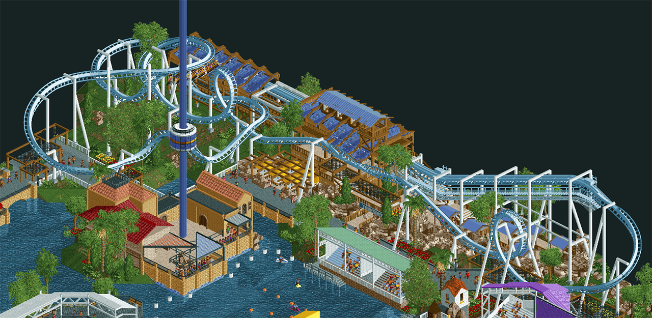
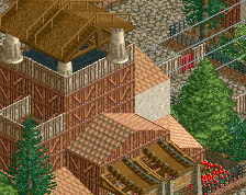
Built for the RCTgo contest along with Henkert (6crazy6king6), InCities, MK98, and Bubbsy41. InCities did the layout, rest is mostly me. Henkert did the Observation tower and some supports. I think this project turned out really well, I'm excited to continue it. Its great working with you guys.
-
 Full-Size
-
1 fan
 Fans of this screenshot
-
 Tags
Tags
Alfy Offline
Wow I love this! Specially the station.
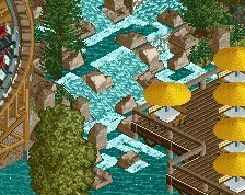
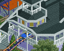
Really nice work on area here. The umbrella patio thing looks a bit busy, but I love the layering there. The station is done very well. The palette here is so pleasant.. I wish the blue for the coaster track was a base game color!
The lift hill+station look amazing, but the rest looks pretty incredibly under-supported. That second loop is pretty much entirely floating.
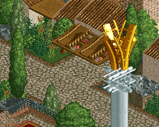
I always loved the positioning of the observation tower here. Great work guys.
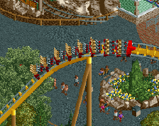
For an open layout as it is, I do like the inline twist in front of the station/above the queue. That's sweet timing/positioning.
as lovely as everything is, I just wish it wasn't another bmtr clone
^ We only had 50x50 to work with. Figured it would be realistic to include a BTR layout, as Sea World already has one in San Antonio. We've already expanded the park to be about 3 times larger, and have included some significantly larger rides
Sammy, its funny. I have that exact same comment when I see these in real life lol
This screen is terrific. Definitely gives off a SW vibe. Without knowing anything about this, my first thought immediately went to SeaWorld when I saw the Skytower.