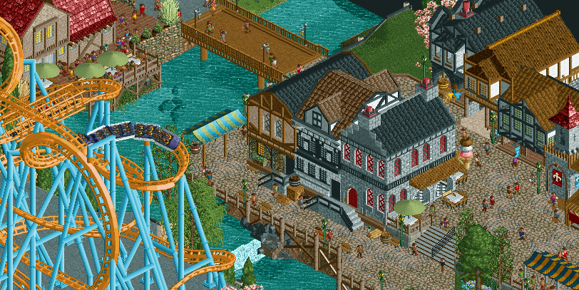
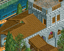
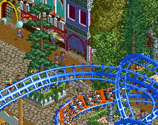
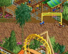
Looks like me and 5dave had a baby. Overall it's definitely solid Archy, maybe the ice cream store cold use a little more facade details but it's still quite nice. Definitely an interesting project you have going on here.
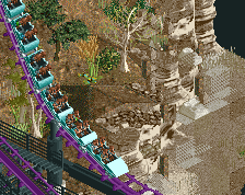
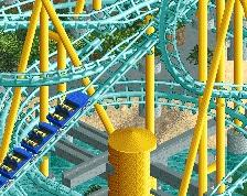
I actually just noticed the Ice Cream haha. Love that little detail. I'm never a huge fan of the grey bricks in game though - but I suppose it fits the theme you're going for. The coaster colors are great.
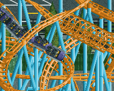
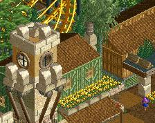
Great work! You've succesfully captured that old European town feel. But tbh, I'm not sure of the muted colours of the town work well combined with the flashyness of the coaster right next to it.
Weird for me to say but I think Jappy is right on the coaster colors from this angle...maybe it makes more sense from the other 3 and just looms over the village here? Otherwise a grey support and dark red track might do as an option, but overall a lovely area. The 3 townhouses in the back are nice as well.
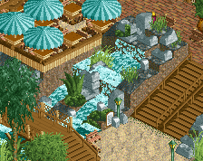
Like it a lot; I wish the cobblestone path wasn't held up by wood beams along the water edge there as it looks fine at first glance but then kind of become silly.
Coaster side / left side of the screen looks great. Right side feels more disjointed yet somehow super clean. It might be the use of several browns and the detail on the buildings always being a different color than the walls themselves.
Its less that the colours are bright or eyecatching, itm, more that they're contrapuntal.
The problem that people are having with it is that it doesn't support the palette established in the rest of the composition. perhaps in wider context it fits, but in this screen, they're right.
at that point, it just matters whether you care about that or not.
 22-June 19
You are very good at playing RCT2.
Nice ice cream cone
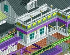
The 3 row houses look sweet, as does thedelicious ice cream!
I actually just noticed the Ice Cream haha. Love that little detail. I'm never a huge fan of the grey bricks in game though - but I suppose it fits the theme you're going for. The coaster colors are great.
Sea of Sagas, is that you?
Great work! You've succesfully captured that old European town feel. But tbh, I'm not sure of the muted colours of the town work well combined with the flashyness of the coaster right next to it.
Weird for me to say but I think Jappy is right on the coaster colors from this angle...maybe it makes more sense from the other 3 and just looms over the village here? Otherwise a grey support and dark red track might do as an option, but overall a lovely area. The 3 townhouses in the back are nice as well.
Guys, that's how parks work... The coaster colors are bright to draw your attention
Like it a lot; I wish the cobblestone path wasn't held up by wood beams along the water edge there as it looks fine at first glance but then kind of become silly.
Coaster side / left side of the screen looks great. Right side feels more disjointed yet somehow super clean. It might be the use of several browns and the detail on the buildings always being a different color than the walls themselves.
timmy is correct. keep the colors
Gorgeous!
Its less that the colours are bright or eyecatching, itm, more that they're contrapuntal.
The problem that people are having with it is that it doesn't support the palette established in the rest of the composition. perhaps in wider context it fits, but in this screen, they're right.
at that point, it just matters whether you care about that or not.
delete me papa
fine micro and nice scale
boring for me though