Screenshot / Garden of Palaces Park
-
 16-June 19
- Views 1,746
- Fans 0
- Comments 12
-
 Description
You will find it funny but since January 2019 I'm trying to create a park with Palaces only.
Still much to build.
I researched some amazing screens Palaces, but trying to build without copying, just taking advantage of the ideas to help me in this park. -
 Full-Size
-
 No fans of this screenshot
-
 Tags
Tags
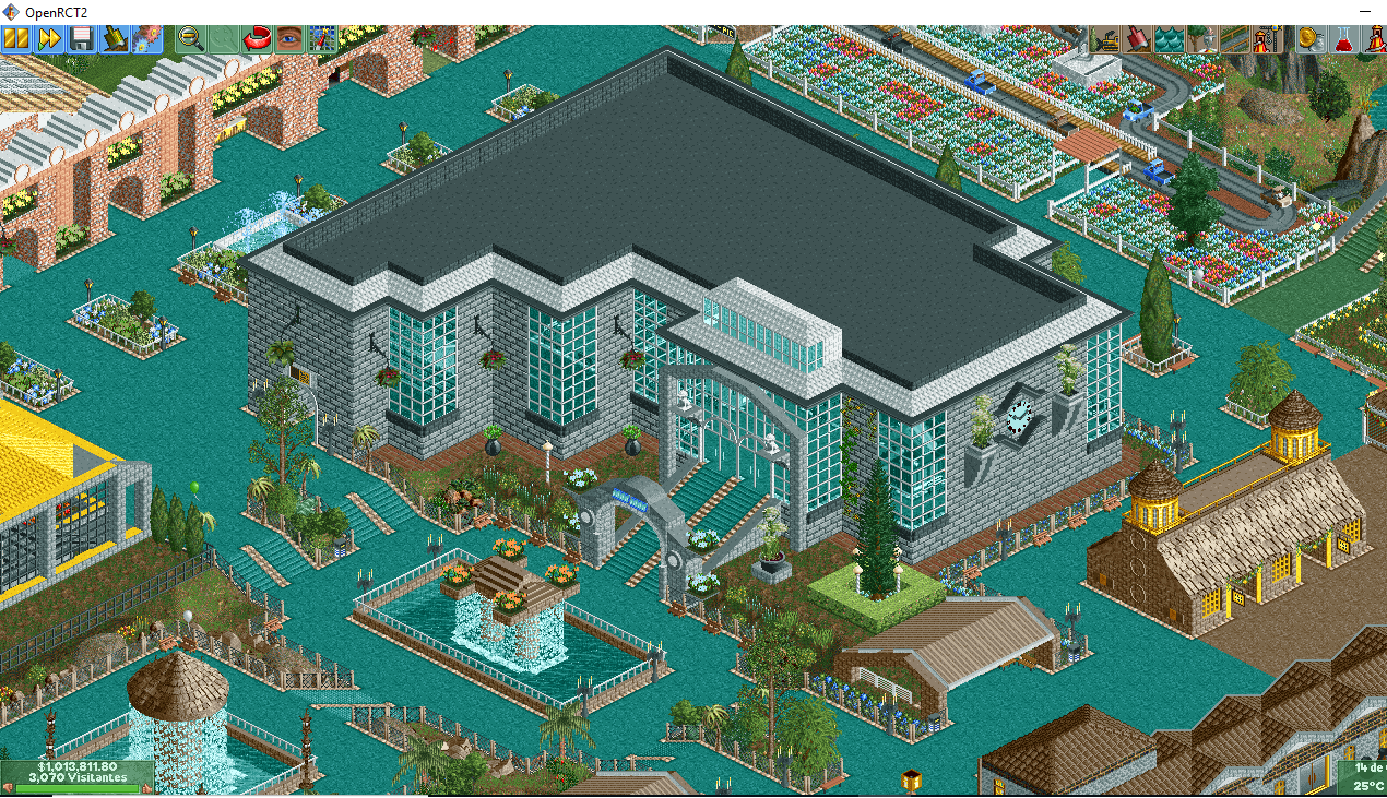
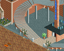
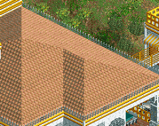
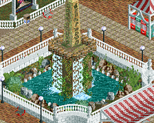
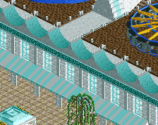
I think your really improving MTC, your buildings are starting to take shape. There are nice elements here like the clock on the wall and both fountains. Path colours are wacky, but I think I like the blue. The brown and the green path don't really fit with the rest of the screen.
Keel building, keep having fun.
The teal path is weirdly lovable. Looking forward to this.
I really dig the creativity you involve. Keep it up, your architecture is really improving!
Wow an ocean of blue path.
When I first opened this, i thought there was water everywhere. It took me a minute to realise it was path...
Your buildings are improving so much, I really like what you created here.
I think you can do better with the landscaping! If you want to make it look like a palace, I would expect it to be surrounded by grass and pretty gardens! Not mud and weeds. Your palace needs a lawnmower.
I like the building itself quite a bit. It's more of a museum than a palace, but it's good looking either way. I also like the blue paths. Interesting choice but I think it works!
haha true (THX)
Hmmm ok ok, thx
Attached Thumbnails