Screenshot / Mechanical Garden
-
 16-June 19
-
 Kingdom of the Moon and Stars
-

 3 of 5
- Views 2,024
- Fans 2
- Comments 14
-
 Description
Hey guys,
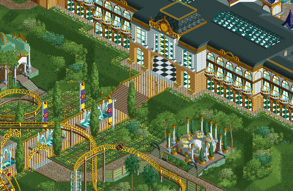
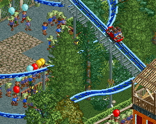
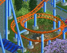
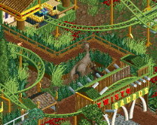
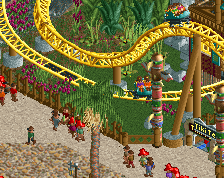
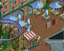
Here´s an update on my new project. I got inspiration from the concept art for Cirque du Soleil´s Mechanical Gardens. I´ve struggled a lot with the foliage. I wanted to give it a bit of a mediteranean garden kind of vibe (like the Alcazar Gardens in Sevilla) but without all of the straight lines. Advice on the foliage (as well as on other aspects of the screen) are welcome. -
 Full-Size
-
2 fans
 Fans of this screenshot
-
 Tags
Tags
that looks awesome. loving all the yellow
It's so weird but I really like it.
great screen. Love the concept.
This is fantastic! But yeah, I agree with G Force about the interior.
I think you nailed the foliage, It really adds to this screen. Carousel cover looks great, as does the coaster. Nothing looks out of place really.
The archy on the palace is great, But as mentioned above you really need an interior. A grand interior would take this screen from good to something special in my mind. Maybe one side could be a ball room dance floor kinda deal, with a banquet hall on the other side and reception area in the middle. It doesn't matter what you decide to do, but something has to go in there.
Alfy Offline
Wow love this screen. The custom supports look amazing. As many have said the interior look a bit bare. I think maybe instead of doing a checkerboard interior, make them diamond style instead. Might make it less grid like looking. Still amazing building, love the atmosphere!
Really good stuff. I think you succeeded in making it feel like a garden. Not as easy as it looks, so well done. The golden ornamentation on the builder is perfect. What I'm not sure of is how wide the gate into the building is. I would continue the vertical lines from the window above all the way to the ground.
Thnx guys. I'm glad you like the foliage. As I already said, it took me quite some time. I love how you guys start about the interior of the hotel, I was so focused on the park and foliage that I hadn't even thought about an interior. I'm gonna work on that!
@Liampie; I get what you're saying. The gate is going to be one of the entrances to the park so I do think it needs to be quite large, but I agree that it is very open now. I think I'm going to experiment with it once I get the park full with peeps.
i just want to add that the use of the hobbit door is perfect. definite +1 in skill level when you start using objects in nonstandard ways like that