Screenshot / B I O P H Y S I C S
-
 15-June 19
- Views 2,195
- Fans 0
- Comments 10
-
 Description
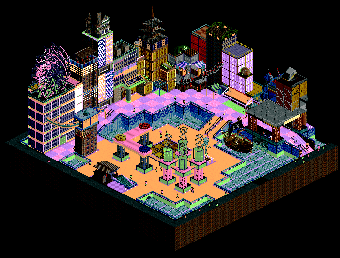
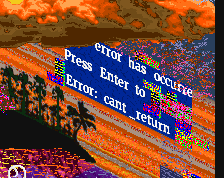
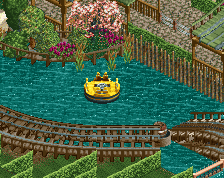
My entry for Deurklink's MP plots Round 17. I'm not too proud of this honestly.
At the time I made this I thought I had something really nice, but as time goes on I realize how sloppy this is from being rushed.
For more information about this round, here's the video Deurklink made: https://www.youtube.com/watch?v=CBi1Y3Ymcw0 -
 Full-Size
-
 No fans of this screenshot
-
 Tags
Tags
I think it shows some skill though, and I would like to see more stuff, but without the weirdness.
I have no idea what i'm looking at
I look forward to seeing the full release at some point.
Sadly it won't be a full release - It was for a multiplayer plot contest.
this is fun! i like it!
Remind me of StarCraft®.
I was kind of in a rush when finishing the upper/rear buildings, and I guess you can say it was kind of a contrast to the brighter area near the bottom of the image. I was trying to go for something invoking a lot of the color scheme.
I really wish I planned the area out better though.