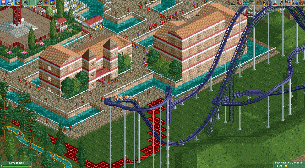
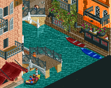
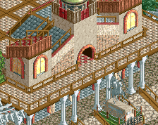
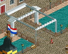
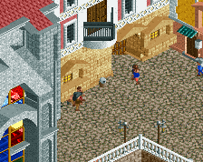
Screenshot / RC&F server Venice/canal ish area Collab with Enrico Dandolo
-
 03-June 19
- Views 1,240
- Fans 0
- Comments 2
-
 Description
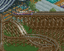
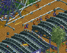
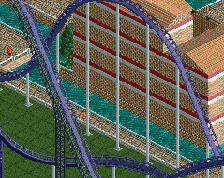
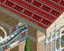
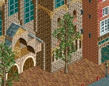
me and enrico decided to do a collab area on here and we decided on a venice area but not exactly (cause we both suck at ncso) this is honestly not a bad building although i might change the stripes cause it seems to rely too heavily on them (the windseeker is enrico and the b&m is mine)
-
 Full-Size
-
 No fans of this screenshot
-
 Tags
Tags
Throwback to https://www.nedesign...rets-of-venice/
Nice idea adding canals to your park and I like the roof choice!
I'd suggest incorporating less bricks and using more flat wall textures for Venice. Additionally in Venice the composition is very different to what you have here. Normally the paths between the buildings are very narrow, while they're almost completely surrounded by buildings, unless there's a small canal to one side of the paths. Google for "Venezia Aerial Photo" and you'll see how dense it is.