Screenshot / Spellbound & Incantation - EDK
-
 17-May 19
-
 Everland Discovery Kingdom
-

 5 of 10
- Views 1,554
- Fans 3
- Comments 8
-
 Description
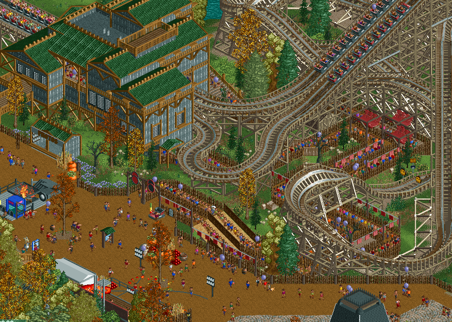
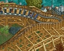
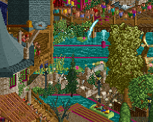
At All Hallow's Eve, we thank the gods for the harvest with a big fire and sacrifices. Pagan magic is also the theme of the park's two racer coasters by GCI: Spellbound and Incantation!
As requested on Discord, i'm reposting an edited version of this here on the site. Enjoy! -
 Full-Size
-
3 fans
 Fans of this screenshot
-
 Tags
Tags
i like this vibe
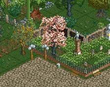
I think it's too much path tbh, but the rest is pretty ok. The coaster colors look really good also.
RMM Offline
too cool.
Whoa, are these the same duelers we were talking about earlier in the week? Were white and brown on discord?
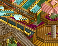
Fast progress! I think the station building could use a little more thought; it's a bit of a formless jumble. The brown looks great on those wood supports. Queue entry is cool and the sunken queue is a cool idea, but a little plain. Demo car at the entry is a nice touch.
I'll say the coaster colors are off-putting to me, although I may be in the minority about that.
The windows on the station building ought to be higher, to match where the queue is. The half wood supports over the queue look a bit odd too.
Empty grass patch in the lower-middle of the screen looks... well.. empty. Stack some punkins there!
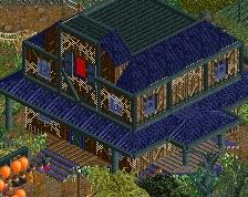
Otherwise, this project as a whole seems so real to me. It's incredible work, seeing the haunted house we saw last screen in the lower corner here -- I can picture how this is all coming together.
I love that there's a good amount of path. Fits this so well. Lovely queue, nice colours. Looking forward to more.