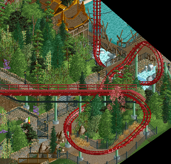
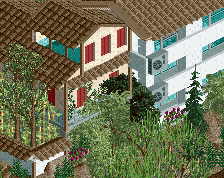
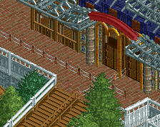
That's nice. The pink tree pops nicely, maybe put another one in the top left corner? The support poking through the track is also a bit unfortunate. Again, a tree may be the solution. Just block the view with a tree. This isn't a good angle for that drop anyway I suppose.
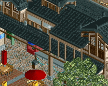
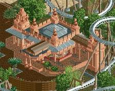
I still think some of the coaster details can be better but the rest looks great. Love the wood lattice work and archy.
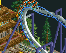
Coaster things I'd like to see improve are mostly the catwalk (whats going on with the railing there?) and the lift support bits. Like that Tennessee Tornado pic I showed you, a spine in-place of a classic chain return would probably be better, in addition to beefier supports in the form of standard A-frames like most B&M coasters use.
@Bubbsy: What would you like to see differently in the foliage? What is it you don't like?
@G Force: I indeed noticed after uploading that the catwalk isn't finished, this will be fixed. The chain return looks a bit better from the other angles I would say as I did add like a green trim underneath it. It just looks a bit wonky from this angle. I will experiment a bit and see if I can find something better.
Looks good, although this screen is again very confusing. Why do you keep composing and cropping your screens in such a weird way? Are you purposefully trying to undersell this project?
@Faas, not sure how you could compose a screen in a weird way without the park looking weird so not sure what you mean . The crops are just to filter out unfinished/weird stuff.
@FredD, thanks. The angle on discord probably looked better but was also more unfinished. I thought this angle also looked kinda cool.
 13-May 19
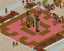


That's nice. The pink tree pops nicely, maybe put another one in the top left corner? The support poking through the track is also a bit unfortunate. Again, a tree may be the solution. Just block the view with a tree. This isn't a good angle for that drop anyway I suppose.
Awesome atmosphere! Great work!
This looks great! I do agree with Liam about the tree though. Both to balance out the screen and to block the support haha
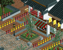
woah, nice work
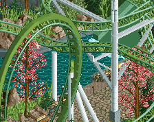
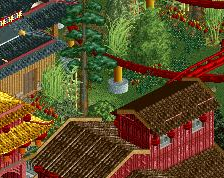
Looks good, foliage could use a little work, but other than that everything is very nice.
I still think some of the coaster details can be better but the rest looks great. Love the wood lattice work and archy.
Coaster things I'd like to see improve are mostly the catwalk (whats going on with the railing there?) and the lift support bits. Like that Tennessee Tornado pic I showed you, a spine in-place of a classic chain return would probably be better, in addition to beefier supports in the form of standard A-frames like most B&M coasters use.
@Liampie/In:Cities: Trees were added.
@RWE/dr dirt/MrTycoonCoaster: Thanks
@Bubbsy: What would you like to see differently in the foliage? What is it you don't like?
@G Force: I indeed noticed after uploading that the catwalk isn't finished, this will be fixed. The chain return looks a bit better from the other angles I would say as I did add like a green trim underneath it. It just looks a bit wonky from this angle. I will experiment a bit and see if I can find something better.
Thanks for the comments
It looked better from the other angle you showed on Discord Nevertheless some quality work and I'd like to see more!
Looks good, although this screen is again very confusing. Why do you keep composing and cropping your screens in such a weird way? Are you purposefully trying to undersell this project?
@Faas, not sure how you could compose a screen in a weird way without the park looking weird so not sure what you mean . The crops are just to filter out unfinished/weird stuff.
@FredD, thanks. The angle on discord probably looked better but was also more unfinished. I thought this angle also looked kinda cool.
It looks lovely, Rec.
The colours of the foliage work very well with the red coaster. Interested to see more!