Screenshot / Dynamite Dunes - Dynamite Blaster redone!
-
 08-May 19
-
 Ardu Altaslia - Completed
-
 1 of 7
- Views 2,659
- Fans 1
- Comments 10
-
 Description
Dynamite Dunes is the second scenario in the chronological and OG RCT1 game, but I want to remake it in some sort of project(s) called 'Realistically Remade' where I look at, and redo in a realistic manor, a lot of the RCT1 and RCT2 scenarios we know and love.
Next up is Dynamite Dunes, which I have called 'Ardu Altaslia' which literally translates (or should) to "amusement land" in Arabic.
I set for a highly Arabic/tropical theme throughout the entire park, but Mayan Adventure, this Vekoma Minetrain which opened in 2006 with the park is one of the few slow-paced attractions for younger crowds at Ardu Altaslia. It has a heavy Mayan based theme and does in fact duel!
Because Arabia has a lot of money and support from Nigerian princes, Ardu Altaslia is one of the only parks in Arabia. It's hotter than heck, but there are (will be) a slew of fast paced rides and an abundance of scenic and fun water rides for the crowd to enjoy.
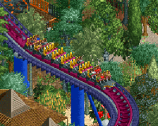
While coaster growth has exploded in recent years with the addition of Vulcan (B&M Invert 2012), Storm (Mack Hypercoaster 2016) and just recently, Lightning Flash (Mack Launch 2019), the initial start was slow, with two coasters opening. Then in 2009, their Mack water coaster opened, and that set the bar for coming years, and, the Nigerian princes finally looked toward this young park.
------
Comments and tips are always appreciated! I'm not done with Tivoli Graense of course, but I wanted to start upon the second scenario so that I don't get bored of the first project.
As always, the surroundings are quite unfinished, and I may redo some of Storm"s layout because currently, it looks like trash going over this ride.
Thanks for the comments this, and on Tivoli Graense as well! You are keeping me going!
Note: My apostrophe key is broken, but that key + shift = quotations works fine for whatever reason. -
 Full-Size
-
1 fan
 Fans of this screenshot
-
 Tags
Tags
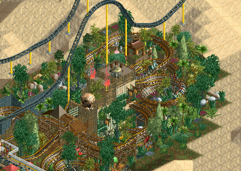
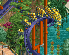
I like the track combi, that's really nice. I hope it doesn't clip too much though. If it does, lower the mine train track with one unit using Tile Inspector.
The giga coaster isn't necessary imo. Looks a bit unrealistic.
I love the track mixture and dense foliage, I look forward to seeing how you transform Dynamite Dunes!
Layered track doesn't work for me. Maybe if it didn't clip.
Pretty messy and dense but it looks good in general.
This would be super awesome without the giga.
I have a love/hate relationship with this scenario. It's such a classic, but I was always short of money. Dynamite Blaster is a classic though! I love this, I love the setting and the foliage, but I agree with CC9, the giga doesn't fit.
honestly? Not much of a fan, but I think it's an interesting concept. The giga really does get in the way but ultimately I think this area has too many clashing and similar textures and colours and the composition isn't really making the most of what Dynamite Blaster has to offer.
The theme and execution didn't take advantage of the landscaping, so the hole the coaster is in looks a bit awkward and strange. It needs a bit of negative space to let it breathe and something to make the cliffs look more involved. A waterfall maybe? Or even just making the cliffs taller and wider to break up the foliage layers and let the coaster itself stand out a little bit more. The foliage and landscaping itself could do with more variation in the colours and textures, it's all very flat right now (the exact same grass everywhere for instance) and hard to take in any detail that's there.
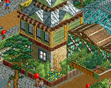
The central building is interesting in shape and design but the objects used in it feel random and don't feel like a themed area of a park but more like they are forced in to make it look more mayan, and imo if you need to throw random full tile objects around to express a theme then you aren't really doing it that well. he skull and mausoleum for instance aren't actually that visible from the ride at all and the whole thing is blocking it's own sightlines, and the bunny hop over the lift hill has some very awkward roof work that isn't really necessary.
This whole thing might sound insulting, but I mean it all constructively. I like the idea of what you're doing and I enjoy the passion you have for all your work, it shows through and makes it all really charming.
Maybe this sounds weird, but I think in this scenario play stuff you've uh, been trying too hard. Hypocritical, I know, it's not like I actually finished White Water Park or Vapor Rocks, but they were big learning experiences for me. You've been trying to make all of your screens have something big and flashy and unique in them in a way that's actually leading to your composition declining imo. Your skills have been improving a lot over time and you were really showing that in Paradiso Medievale and the B&M standup thing.
I noticed this a lot in Tivoli Graense and Redlynch as well, you were placing all of these large and dominating rides in awkward spaces where they didn't really fit the environment well or give it much breathing room. In this case your scale is smaller but I think you've also been handicapping yourself by setting such restrictive and detailed lore behind the parks.
Anyway I'm really interested to see how you and this scenario play evolves, so keep it up! <3 Sorry for the wall of text
+ I like how textured it looks
- The giga completely disregards everything else in the screen
Imo, I HATE, HATE, HATE the giga's colours like it is, and the path it once took, but believe me; the new layout is so much better and is so much less clashing.
----
Thank you for all the comments, especially Shnupz. There's a lot, and perhaps too much texture here and in the Mayan themed area (it takes up a good portion of the park), but I wanted to make it quite messy so that it appears like if you went into a Jungle and found these large structures. I will have to clean it up a little bit, though, because I do agree there is a lot going on.
Foliage a bit too.
I don't think I mentioned it, but of course it is not yet done. I also forgot to crop the screen more because it was like 4am and I am 'high' on medicine because of my surgery...but, hey, what can ya do.
I may also mention, this park is going to be very heavily themed. As well as Tivoli Graense. Perhaps not the most realistic thing ever, but a lot of parks are very heavily themed and immersive; I have to improve my method upon that though.
Thank you for all the comments again, and soon I'll post a 'better' screen in this comments section to show the improvement.