Screenshot / White Water Rapids
-
 18-April 19
- Views 2,089
- Fans 2
- Comments 14
-
 Description
Micro madness has really got me back into the swing of things, I'm enjoying the game again for the first time in a long time. Yes this is a reboot of 7 year Frasier Lake on a ancient bench lol.
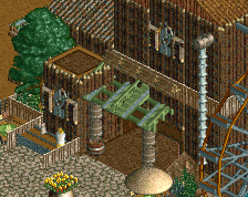
I'm trying really hard to focus on sight lines and interaction. I picture myself sitting at a table of the boathouse beside the waterfall watching Banshee(woodie). -
 Full-Size
-
2 fans
 Fans of this screenshot
-
 Tags
Tags
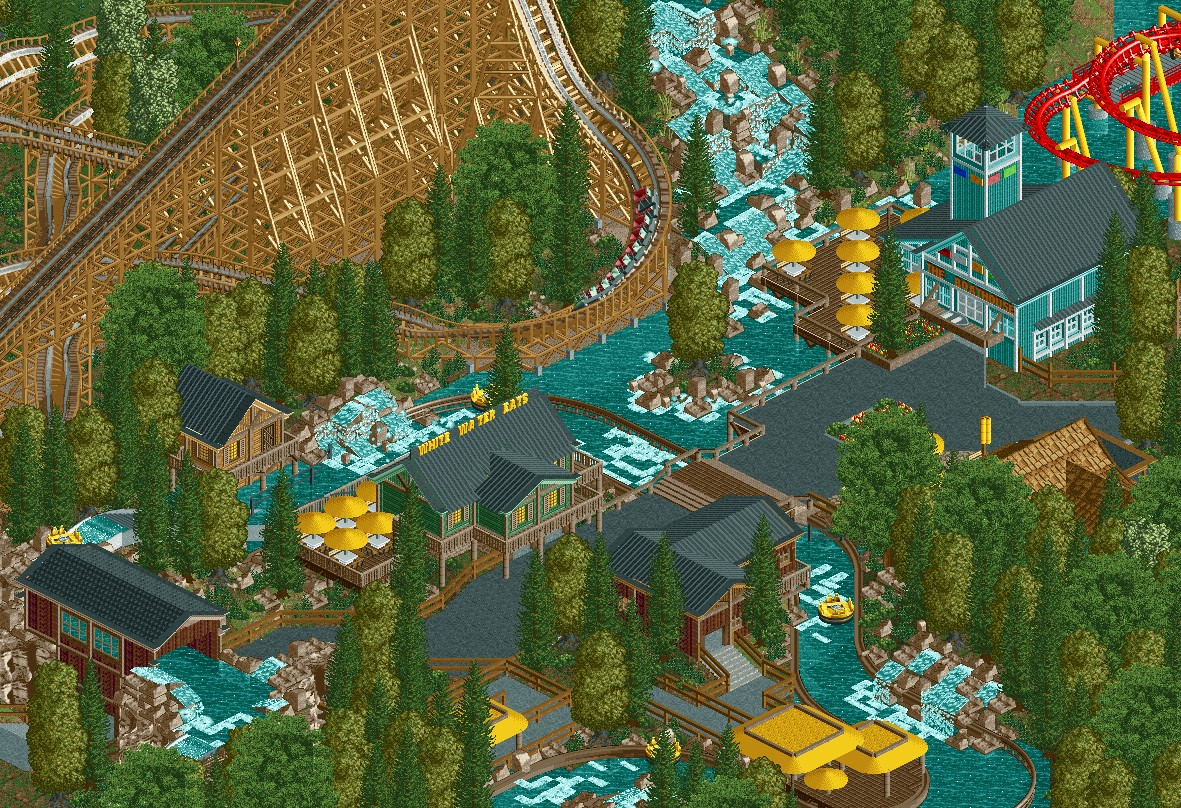
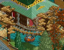
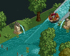
Classy stuff! Not much to say about really, just keep going! But if I do have to remark, talking about sight lines, maybe get rid of the tree on that little island, so the guests in the rapids can have a full view of the waterfall in the back. Also, some lights, benches and bins would add a lot to this.
This is a very well laid out area, man. Great flow. Just a few things holding it back:
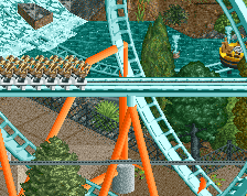
- Foliage mix is not good, in my opinion. In fact almost everything you did completely contradicts my personal foliage code. Yellow trees with purple looking trunks, is this a real park or an LSD trip?
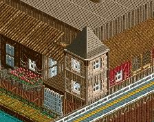
- Blue building surrounded by water visually becomes water. Pick a different colour or just a different shade of blue.
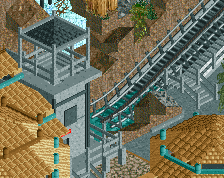
- Same problem with the black roofs in the centre of the screen, they completely blend into the path and it fucks with the depth.
These issues aside, this is really good and potentially 80%+ work.
Great start! Like liam said, this could be amazing. Just needs some more path details like sign, flags and other little things to really bring it to life
Dude this is fantastic.
I'd agree with Liam in terms of the blue building color. One of the lighter shades would work nicely.
The foliage is great in my opinion haha.
Yeah, I like the foliage too. And please don't get rid of the lonely tree on the island, it's nice the way it is.
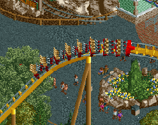
One thing I'd suggest is to vary the colours of the parasols. Perhaps, make one group dark red. Hope to see more soon!
I forgot all about path elements, It looks a lot better with them there now. Peeps will help as well when I eventually string them through. Colours are hard. I think I'm going to keep the boathouse as is. Green blends into the trees to much, ice blue is too strong and the light water blends in even more then the current colour. Maybe I can add some rocky islands under FireHawk's helix to break up the water colour a bit more. I changed the roof of exit building for the rapids from black to brown, that helps break up the black in that area. Lonely tree has been replaced with two smaller juniper tree's that don't restrict the sight lines as much. Liam I'm rollin with the oak tree's, I'll try and cover as many trucks as I can with bushes just for you. XD
Thanks for all the comments, they are really helpful.
Reminds me of DJBRACECHE123
Really like this!
Great work on the Boathouse restaurant. I can see the Disney Springs inspiration.
The water bridge is super cool. I like the layout and interaction in general.
I'd suggest a 2nd secondary color perhaps. You have the yellow everywhere. Maybe an orange or something else to go alongside the yellow.
Great work regardless. Looks really nice.
Great screen, combination of the foliage, landscaping and archy style really makes it atmospheric. Like I was telling you on discord getting those accent colors right is key though, ultimately it comes down to preference and the type of park your going for.
Looking forward to seeing more of this!