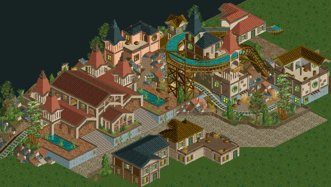
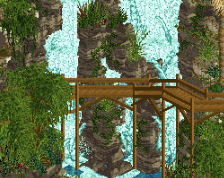
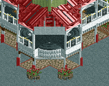
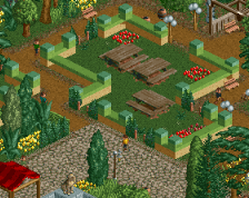
So clean, I love it! The colors are well done, not too muted. I would like to see a bit more thick greenery integrated. That may help offset the earthen tones and give it all some more life. Excellent water ride placement though, it fits very well without feeling forced or too tight.
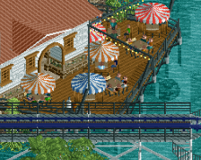
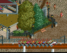
This region looks wonderful -- I love the greenery, the architecture, the subdued color scheme that you've gone with. Is there more of the area that you're planning to build?
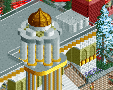
This is a solid use of the Roman palette. As tempting as it can be to overuse neutral colors when a palette is full of them, you seem to have found the right balance between them. Some more green foliage and 50% more purple flowers might make those earth tones pop even more.
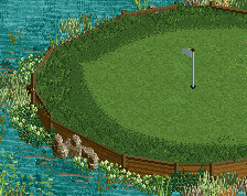
The quarter-tile landscaping is the one consistently awkward feature here: each quarter-tile is very separate from those around them, often in both height and color, which creates, in some instances here, the "checkerboard" pattern. Creating larger shapes with land blocks of the same texture without varying the height in every direction would give it a more natural look (and you wouldn't need to intersperse stone ruins into the perceived gaps).
 12-April 19
this is some good stuff
Nothing to complain about, looks really good. Architecture is great, very original.
So clean, I love it! The colors are well done, not too muted. I would like to see a bit more thick greenery integrated. That may help offset the earthen tones and give it all some more life. Excellent water ride placement though, it fits very well without feeling forced or too tight.
Thanks for the comments!
I will hundred percent look into this, it definitely does need something to liven it up a bit
Ness Fan Offline
This region looks wonderful -- I love the greenery, the architecture, the subdued color scheme that you've gone with. Is there more of the area that you're planning to build?
Thank you! and my current plan is build the full park in this style (mind you it will just be 50x50)
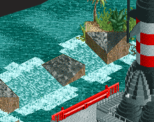
Simply charming I'd say it has a kind of whimsical grandeur.
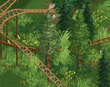
A few colourful flowers here and there wouldn't go amiss
This is a solid use of the Roman palette. As tempting as it can be to overuse neutral colors when a palette is full of them, you seem to have found the right balance between them. Some more green foliage and 50% more purple flowers might make those earth tones pop even more.
The quarter-tile landscaping is the one consistently awkward feature here: each quarter-tile is very separate from those around them, often in both height and color, which creates, in some instances here, the "checkerboard" pattern. Creating larger shapes with land blocks of the same texture without varying the height in every direction would give it a more natural look (and you wouldn't need to intersperse stone ruins into the perceived gaps).
thanks for the comments!
I honestly didn't realize how weird this looked until you pointed it out, I will have to do something about that