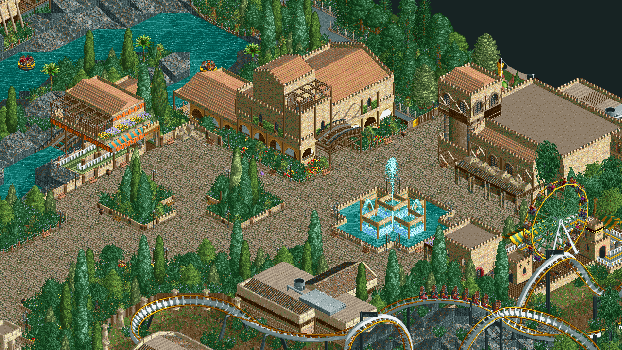
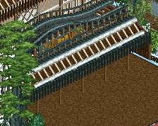
This is some pretty sick NCSO, dude! It's like a flashback to the times before everyone spammeded trackitecture in NCSO. Reminds me kind of of Kidron Park. I love what you did with the rapids station!
This is really nice. Almost old school in some ways. I assume this is part of your RC&F Challenge entry?
Actually this is a park i did for GTW's Winter contest a month ago, it's a 50x50 mini park. although you gave me an idea to just expand the park border to 100x100and like make the rest 3/4 of the park but i doubt the rules will allow a premade structure
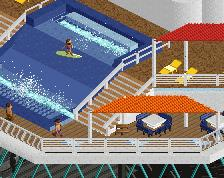
Very quaint work. I highly praise you for not relying on tons of trackitecture. I really like the fence you made using pirate wall mixed with medieval walls.
Really nice work. Lovely composition and everything has room to breathe. Not quite sure how I feel about the pattern made with the signs, but it shows you have an knack for experimenting and that's always a good sign.
That pattern made with the signs is my favorite bit of this screen! Good work. Could use just a little extra splash of color and some more variety in building materials though.
 09-April 19
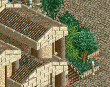
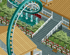


This is some pretty sick NCSO, dude! It's like a flashback to the times before everyone spammeded trackitecture in NCSO. Reminds me kind of of Kidron Park. I love what you did with the rapids station!
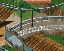
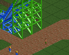
I love how spaced out this is. Very good.
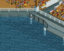
The mountains in the background seems good to me
Absolutely superb! Great use of the single width signage Can't wait to see more
This is really nice. Almost old school in some ways. I assume this is part of your RC&F Challenge entry?
Ling, on 09 Apr 2019 - 7:16 PM, said:
Actually this is a park i did for GTW's Winter contest a month ago, it's a 50x50 mini park. although you gave me an idea to just expand the park border to 100x100and like make the rest 3/4 of the park but i doubt the rules will allow a premade structure
Wonderful composition.
Very quaint work. I highly praise you for not relying on tons of trackitecture. I really like the fence you made using pirate wall mixed with medieval walls.
Love this. Great composition indeed, good detail balance, good colour balance. Keeps the RCT charme which makes this very atmospheric to me.
Really nice work. Lovely composition and everything has room to breathe. Not quite sure how I feel about the pattern made with the signs, but it shows you have an knack for experimenting and that's always a good sign.
That pattern made with the signs is my favorite bit of this screen! Good work. Could use just a little extra splash of color and some more variety in building materials though.
Very, very nice classic RCT2. Composition is good and I really like the architecture. Could maybe benefit from a touch of colour here and there.