Screenshot / Starfruit Empire
-
 24-January 14
-
 Vitaminland
-

 10 of 21
- Views 2,900
- Fans 1
- Comments 12
-
 Description
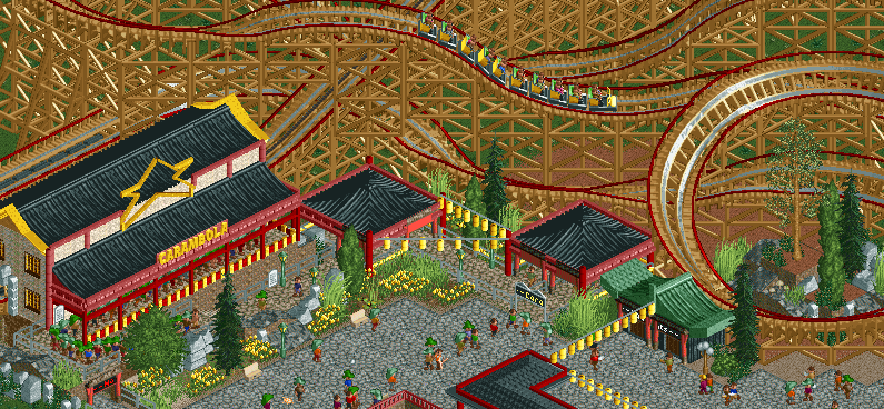
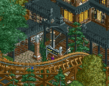
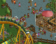
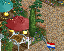
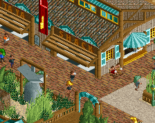
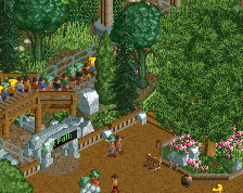
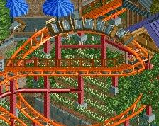
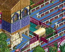
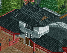
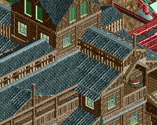
The main ride of Starfruit Empire is Carambola, a twisting wooden rollercoaster that will send you flying through our Japanese themed area.
This is my first CSO attempt at an Asian theme and I'm not really sure about it. Tell me what you guys think. -
 Full-Size
-
1 fan
 Fans of this screenshot
-
 Tags
Tags
this park will be so freaking fun!
I feel like it's not as refined or 'fun' as your other screens, but it's nice nonetheless.
I would try and add some other colours into the yellow hanging things, try some orange in there, would liven up the screen a bit more.
The rockwork and foliage is done really nicely too
i think its pretty good. maybe there are too much of those yellow lamps. keeping every second of those would look better if you know what i mean.
I changed the colour of some of those lamps. It makes it feel more varied in such a way that the problem thirteen mentions is also solved. Thanks for the tip Louis and thanks for the replies.
looks great, i like your other architecture better, but that might be because i hate those 1 tile asian roofs
I'd almost suggest putting a load more of them chinese lanterns, they really make the area look immersive.
The area to the right of this screen has more lanterns. Don't worry, I fucking love lanterns.
I can't wait to see this when it's finished.
love it! need some lanterns in my chinesey area
Who doesn't love lanterns
thats lovely!
This looks quite nice, although pretty crammed together. The queue could be better integrated into the ride, it looks like an afterthought to me. The lanterns would look better in white I think. Also I'd suggest adding overhangs to the roofs to make them look more Asian.
Keep it up!
"MFG"