Screenshot / Mine Theme
-
 19-February 19
- Views 1,213
- Fans 0
- Comments 2
-
 Description
My First Screenshot on here and i just wanted to share my first park i made using scenery pieces, I liked Mine theming since the first time playing rct2, So i thaught to go with that, This is already 4 years old and have made progress since then, will share it in the future.
-
 Full-Size
-
 No fans of this screenshot
-
 Tags
Tags
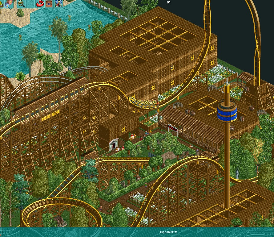
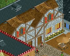
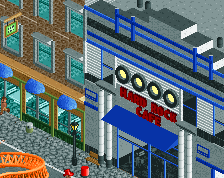
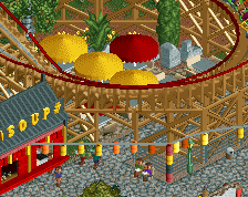
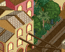
Bit too much saturated brown here I think, make experiment a bit more with the other shades of brown if you want to use these object.
I already did change it up a bit, This is a park I made 4 years ago and first time using scenery pieces. When i look back at it now I also see it's not the best work.