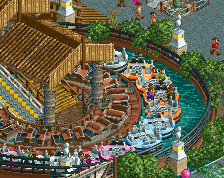
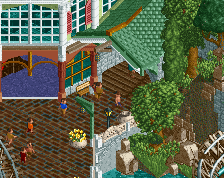
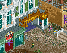
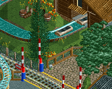
Screenshot / Entrance + River Sizzle
-
 21-January 14
- Views 2,227
- Fans 0
- Comments 17
-
 Description
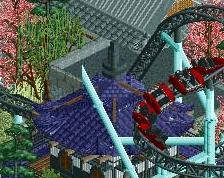
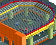
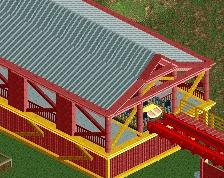
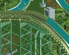
Here's a shot of my new park. Those NCSO parks will be discontinued for a while. I felt like i finally got the entrance right for a park for once, so i'm definitely continuing this! Yes, there's a few minor bugs and some small parts haven't been added, but there's more stuff finished in this screen than unfinished (to everyone that hates unfinished screens).
-
 Full-Size
-
 No fans of this screenshot
-
 Tags
Tags
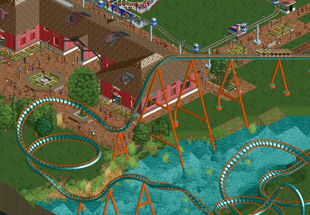
Cool man. You're finally getting better. Somehow I have the feeling that it is because you are willing to spend more time on an area without being done with it and posting it here. Am I right? Keep up the good work!
Well i thought you actually didn't like unfinished screens.. I like to show stuff off and get tips if i need them.
Well if the part that you want to show (the entrance in this case) is finished I don't care about unfinished screens. But this screen looks like it has way more time and thought put into it than your other screens. That's why the entrance looks good.
I don't like the layout however.
I don't think the coaster is bad at all really, i wanted to make it go around the river and at least i didn't fail when i tried to do that. And it works quite well, not an awful rating or lateral g's going up and that stuff.
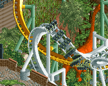
First drop is soo awkward, #NOFLOW
Idunnowhatswrongwithit #OHNOW
If you make such a steep turn make sure it's at the beginning of the drop, not at the end. This tends to hurt and kill flow. And it's not only about ratings and lateral g's, it's about how it looks.
^Well said.
For me, it's never about ratings. I never look at them.
@faas
Oh, okay. I'll see what i can improve.
@louis
WUT WHY
AWA()w8rjfn93qnano9i
I always check the ratings, if they're too high, people won't ride coasters. Duh.
True, but good ratings doesn't make a coaster a good coaster.
Well good ratings do make a coaster better in some way. At least people ride River Sizzle and i'm happy enough about that,
I don't look at ratings because most of the time, if you make a good looking coaster, that flows well, the coaster will have good ratings.
Whereas if you make a coaster with good ratings, most of the time, the coaster won't look good.
nice to see some CSO and almost finished screens from you wouter, but i have to agree with Faas, the layout feels a bit weird, but it's nice overall. i love the way you made the red brick work, i can never get that one quite right. keep up the good work!
Really good improvement. I would definitely recommend you change the layout though. You could probably find a much better way for it interact with the river.
I would recomend changing the drop with the steep curve at the beginning and then instead of the weird helix, have a cobra roll. B&M floorless coasters usually have a big inversion to start the ride, and a cobra roll would fit that bill.
^i second what csw said!