Screenshot / Zaccanapoli III
-
 27-January 19
-
 Zaccanapoli
-

 3 of 4
- Views 1,896
- Fans 7
- Comments 10
-
 Description
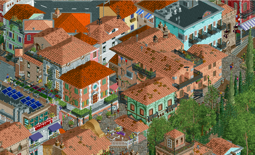
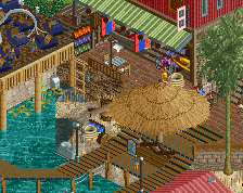
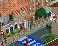
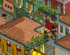
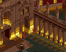
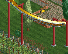
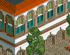
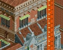
With the new Carnevale season coming to a start soon enough, houses are painted in bright colours yet again to celebrate their Venetian obsession with masks. Banners bearing Italian colours, booked hotels, annoying rough stone roads. Welcome again to Zaccanapoli!
[I've started using a more normal path combo off-screen for my town's central area, and hope to show it off sometime in the future] -
 Full-Size
-
7 fans
 Fans of this screenshot
-
 Tags
Tags
I love this park. It has some very nice details. Not very sure about the orange roofs though.
Really looking solid. The sea of roof is a little overwhelming, but it fits the scene.
Something bothers me about the colours, but it's not the peach. I think you should look into getting a palette that offers a more earthy colour to use in the dark orange's stead. Dark orange can work, I often use it like this, but next to the peach roofs it looks off. Parks like Forum Caeleste solved it with a palette.
Another thing that bothers me is the building with the coincidentally orange roof in the centre of the screen. The ground floor is arches, but most of the arches' legs are obscured by potted plants. This kind of makes it look as if the arches are only two units high, it creates a confusing scene. You need some arches to be 100% visible so that the viewer knows it's a 4 unit high arch. Maybe only put the potted plants in select places.
Overall this is stellar work though. You have a great eye for detail and you use it to give each building an identity. I can easily imagine myself roaming these streets and taking in the scenery. Love it!
The top left section is so dense and off grid it hardly resembles rct, looks crazy.
The orange might be a bit overbearing in my opinion too, though it could just be this specific screenshot.
The archy really does look incredible though, its truly fantastic. However unless every 3rd shop is a Gelato store then I can't say its believable.
- You're definitely onto something, MK. More on the orange roofs later. Much appreciated!
- ][ntamin, yeah and at this point I'm still not sure how I can potentially provide some aspects on the map that aren't the typical sea of roofs that Italian towns usually are. I'm thinking about expanding the map to also include some of the countryside, maybe that does it. Thanks!
- Scoop, not surprised haha that's probably hard to avoid for me but I'll keep trying ways to lessen the peach overload. Thanks!
- I'm happy to hear, MrTycoonCoaster! Balconies are often the most fun to build.
- I agree on both accounts with you, Liam. That centre building must be more than a year old now, and the simple truth is that potted plant row must have grown on me too much for its own good! They need to go. That path doesn't help the case either.
Allow me to explain myself about the orange roofs: at first they were a way to break the sea of peach roofs in the overview, and later to possibly divide the town into two parts: the one more culturally influenced by Venice vs. the parts less so.
But yeah, they don't exactly make that peach coloured building any more flattering. Will look into a pallette change for that dark orange! That sounds really helpful, man. Thanks a lot.
- Hopefully in a good way, roygbiv!
- I can see why it isn't believable G, but I figured if there's one part I can compromise on, it's the boring looking parts of a town. Thanks, man!
I'm so glad you posted it. I told you to!
I generally agree with the peach being a bit overbearing, but I'll disregard that because this is mocking Italian villages....and he perfected that mock seamlessly....