Screenshot / Got wine?
-
 06-January 19
-
 Everstone Highlands
-
 1 of 5
- Views 1,971
- Fans 3
- Comments 10
-
 Description
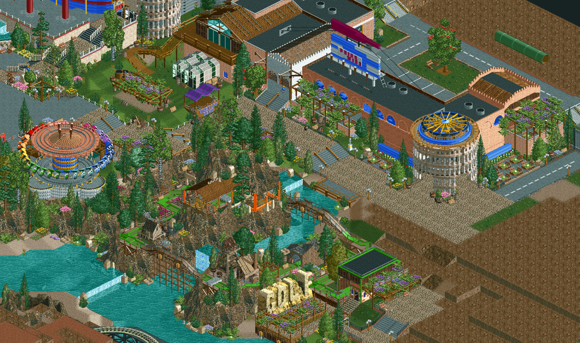
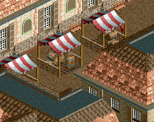
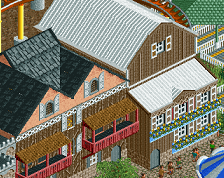
"Enjoy authentic Tennessee Valley wine and cheese at Leroy's, a restored wine factory. And wander down to the Northwest's most adventurous mini golf course. Only at Everstone Highlands!"
Been working on this lately. I have plenty of ideas but very little time to do them. This screen is still unfinished, by the way. -
 Full-Size
-
3 fans
 Fans of this screenshot
-
 Tags
Tags
![screen_7158_Smuggler's Bend @ Oasis [WIP]](https://www.nedesigns.com/uploads/screens/7158/7158_thumb.png)
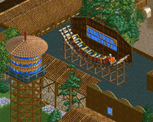
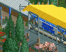
That golf sign, oh my god
How can I politely say that I don't like this too much...?
It just seems so forced to me and doesn't look aesthetically pleasing at all. Also not super keen on the composition you chose for main path, a building front, a mini golf, a river, etc. Just feels a bit unclear and intermingled.
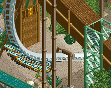
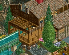
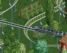
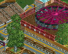
On one hand, I love all of the tricks in this screen. On the other hand, I think you tried a bit too hard with some of them, especially the volcano rocks and the swings base.
I actually really like the minigolf. All of the hacks are wonderful and creative, but I'm not sure yet how I feel about the composition. Maybe seeing more of the park will help.
Perhaps the only suggestion I can come up with is to perhaps make the Archy a bit less boxy but with ncso I know that's tough sometimes.
Really like the mini golf course. Every park should have one.
I have to agree with posix here, it's a medley of good ideas with no flow. Too much focus on new scenery tricks, but with seemingly little intention of fitting it into a context. I think you can do better.
As is said, good ideas though.My favourite thing is the apple tree.
While I agree that it's a little random, it's also a ton of fun and I don't necessarily think of that as a bad thing. Personally I'm a fan.
The tricks shown here are at the forefront of NCSO as always, most notably the wine billboard (the go kart lights have not gone unnoticed), the round tower entrance, and of course the golf sign.
The peach building is the one thing for me that detracts, as it appears lifeless and plain in this otherwise scenic and vivid environment; give it a trim or something so that it looks more inviting and less like a rundown medical facility in East Oakland.