Screenshot / Layout???
-
 15-January 14
-
 Edge
Edge
-

 4 of 4
- Views 2,665
- Fans 0
- Comments 12
-
 Description
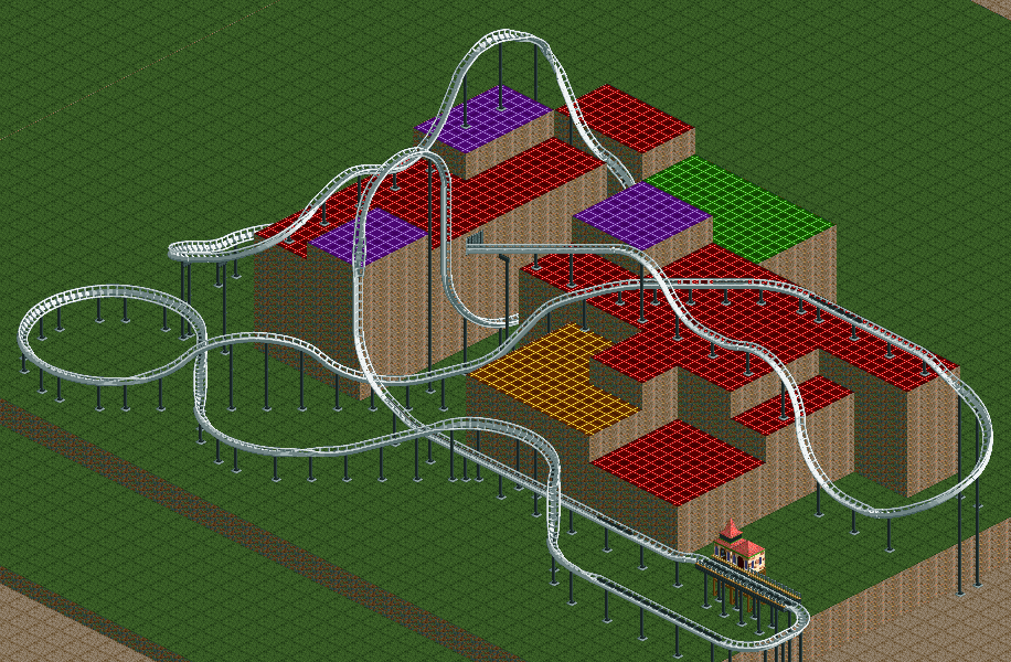
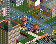
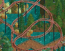
I'm looking for critique, advice, and pointers on how to make this better. If I should just start again, with a different strategy, then please tell me. This is supposed to be set in an urban area, and the colored land is supposed to represent buildings for now.
Basically, I'm starting over on the Mirror's edge park, because I think I can build a lot better than what I had before now, and I didn't do a good job planning, thus I couldn't get a good layout to fit. Now, I'm hoping to start with the layout, getting that out of the way, and letting me build some awesome stuff around it, to make it work better. -
 Full-Size
-
 No fans of this screenshot
-
 Tags
Tags
i'm both sad and glad you started over, you have indeed gotten a lot better, i think that temple you buid and the park recreation you're currently working on are proof of that.
but honestly i think this ride would fit in much better as a sort of indiana jones ride, with impressive landscaping, ancient architecture and other stuff. if i were you i'd put this coaster in your kilika temple park (if it's not a design) and just turn it into something like 'King solomons mines', and just make it look really awesome with that kind of setting and an amesome mountain landscape.
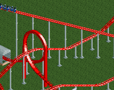
It doesnt make sense as a layout to me. In terms of the top hat being followed by an element that is similar in height to a top hat.
The point of a, tall, top hat (whether it be in a fantasy design or realistic) is that it is the only part of the coaster that offers that sort of height. It's a show piece.
Your top hat loses that due to the large hill that follows.
I also think it is very short before hitting the lift hill.
The layout seems to flow well, but it's not a fantastic layout, because of the reasons above
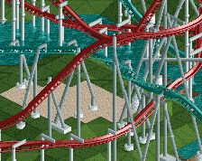
I can knock the second hill down a bit, and swing the last curve out a half turn more, making the brakes and station perpendicular to where they are now, and lengthening the pre-launch section a bit.
OR
I could remove the top hat, place the launch down the alley straight into the second hill, and rework the latter part of the ride, hopefully making it a bit longer to compensate for the missing element.
OR
I could start fresh keeping what you've told me in mind.
Also just remembered, the section after the lift is also too short before the mid course brakes.
I like the hill turn, perhaps remove the top hat and use the hill turn thing as the main feature (kind of like Blue Fire's giant overbank)
Then lengthen the layout a bit until the lift (I'd put a brake section before the lift too). Then lengthen the section after the lift (or remove the mcbr).
Those would be my suggestions. I mean, i'm not 'right', it's just what I would suggest. You've clearly used your imagination for this, and that is impressive, so carry on!
I was trying to build something that felt like parkour, sticking to my inspiration for this build. I think the top-hat is the least "parkour" thing in the layout, so it makes sense to dump it.
The MCBR was more or less just because I didn't know what else to put there.
Haha, why not a barrel roll or something instead of a boring mcbr?
http://i.imgur.com/1YdwiAQ.png
Barrel Roll?
I still feel like something's wrong about it. Maybe because it's so open? Might help to have scenery...
I feel like you've lost the nice ending of the other coaster with this.
I think you can keep the station and launch in the same place. Add a small overbank turn out of the launch to lead it up into the big hill turn thingy.
I agree that a layout is made a lot better when a few bits of scenery are worked in, but it is important to get a layout that you are truly happy with first.
http://imgur.com/lf4bANg
and
http://imgur.com/27ECAyq
are two more variations on this. I really like the dive off the roof in the second one, but I feel like it meanders too much at the end, and the first has a better ending. I'm not sure if I should try to work to combine them enough to get more of the elements I like out of it, or just let it be and pick one of these two.
Add the ending of 1 to the rest of 2
Best bits of both.