Screenshot / Mountain Mining Adventures
-
 10-December 18
-
 The Good Earth
-

 4 of 13
- Views 1,891
- Fans 5
- Comments 11
-
 Description
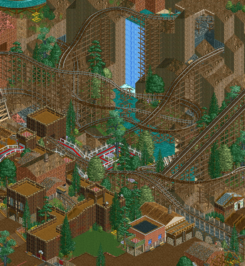
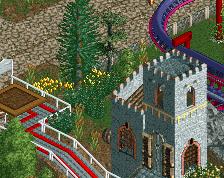
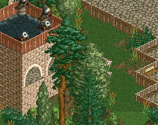
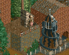
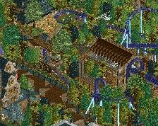
Business is booming in Victoria, site of newly discovered bronze, silver, and gold deposits. The crafty Aussies have developed a revolutionary mining train to carry ore from the mountainsides into town.
The juxtaposition of growing industry with mountain majesty is the perfect setting for the next featured location in The Good Earth.
Obligatory Year 100 screenshot to show that I am still working on this! -
 Full-Size
-
5 fans
 Fans of this screenshot
-
 Tags
Tags
quite nice.
I love this. feels so classic- not sure I've seen that sort of log cabin done so well (and smoothly) before. that patch of grass does wonders too, I can really picture that.
I'd maybe suggest having the landscape conform slightly more to the layout where possible? Like the two lift hills could make a beautiful set piece with a bit of landscaping below and maybe slightly covered
Beautiful stuff. The viaduct over the path is so nice.
Great to see more progress on this park. This area is looking great, I really appreciate the scale of the coaster and the landscape. We don't have enough of that on NE. Some good choices in the theming as well, like the mud roof (with roof textures available, it's so hard to not go with one of those when making an actual roof) and the two toned wooden walls.
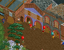
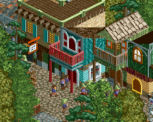
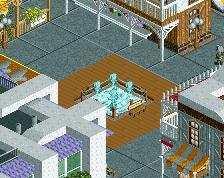
On the other hand I think the buildings in the bottom right corner feel very out of tune. The entire screenshot but that little bit makes me feel like I'm somewhere in Northern Canada, but looking at that corner makes me feel like I'm in a basic bitch rct2 ncso park with mindless fence stacking. I can't read your mind as for what your vision is for this area, but personally I would emphasize on the dark, dirty look you accomplished around the fort. Reminds me of The Revenant which is a great thing.
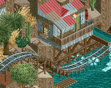
Another thing I'd like to suggest is to support the mine train where it crosses the water. It's a shame mine train supports are pretty much broken in RCT1 and 2, with the gaps on diagonals. Especially in settings like these that is exposed. Just a few inverted or suspended track pieces can make it look a lot better, but that's up to you.
Quite nice. Rock work is a bit out of proportion I'd say which catapults this into semi-realism. But perhaps that's very intentional?
I like the fort-like theme a lot. The stacked fences have been done a couple of times, but your version of them is refreshingly clean.
I didn't see this before but it's so good. I'm really curious how the full park looks with all the dramatic landscaping.
This reminds me a lot of Mt BawBaw and Lake Eildon/Kevington/Halls Gap. You pulled off Victorian alpine really well for LL, great job! It's good rct too, lovely composition <3
I'd look into recolouring the coaster (saturated brown supports or gold track maybe? idk) and queue and/or adding some more vibrant shrubbery to help things pop a little more, as it stands the whole area is very dull brown.
The brick building and the beige one next to it are actually the best part of this for me tbh because they nail the theme perfectly. I think the log cabin/fort walls actually hurt the theme imo. The 2x2s aren't bad but yeah the thin raised walkways feel very Canadian/NA, it's too much like a fort rather than a mine
This is awesome.