Screenshot / Castle of Gold Park | Enterprise
-
 24-November 18
-
 Castle Of Gold
-
 1 of 5
- Views 1,483
- Fans 0
- Comments 11
-
 Description
Hello guys
Following the guidelines received in the comments of Playcenter Park, I will try to make theme in this new park.
This park is still fictitious, the idea is to build only castles and palaces in mid to rides divided into 4 sections. (inside and out of the ground)
I will only have time on the weekends, this project will take months to get ready, because this I will commit the maximum that I can.
The biggest challenge is what to build to do justice to the name Castle Of Gold (please accept suggestions) -
 Full-Size
-
 No fans of this screenshot
-
 Tags
Tags
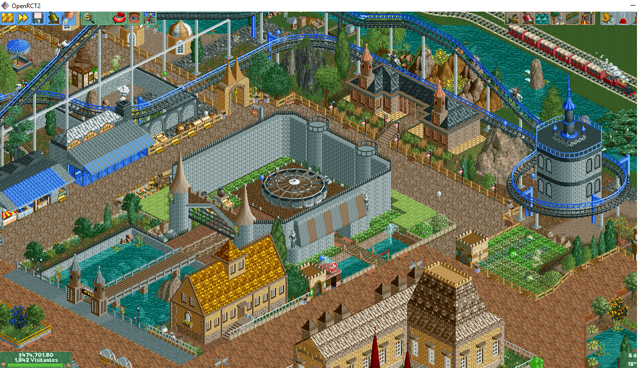
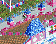
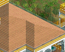
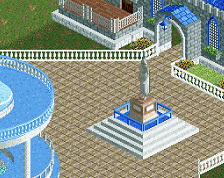
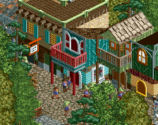
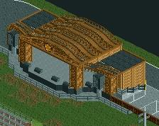
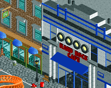
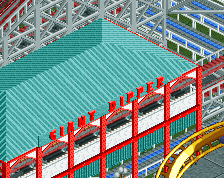
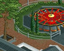
I like very much two neighboring buildings - the one with a golden roof, and a mini palace with a black roof. The castle - itself for me would get some decorations, for example, such as on a gray fence in the left-top of the screen. Maybe I would lower the height of its walls a little and add spaces through which one could see the attraction from all sides? He adapted more solid bridges running through the water.
Blue shops (shops with blue elements) fit the whole.
This looks quite good. This looks a lot more cohesive than your previous work. The brown path at the top of the screen looks really unpleasant, it would probably look better if it was all brick and grey tarmac - use the grey to border the moat or the planters perhaps. The green hedge maze accents in the planters look really good, and you could use them in other spots to make the whole area look more like it goes together. Right now you're relying a lot on the flowers colored many different ways, and that looks a bit unrefined. Adding in some other types of bushes/shrubs and the aforementioned hedges could really pull that together.
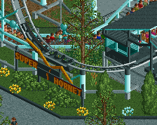
I'm a little unsure of what is going on with that steeplechase coaster with the multi-dimensional coaster track underneath it. It would look fine as just the steeplechase track on its own.
I think this is a big step down for you from some of your other work, for mostly the reasons Ling said. That brown path just makes everything look terrible, change it (and the brick) for something with much less texture, and the screen will take leaps and bounds forward.
Individual archy and detail work is pretty good, like sax said a big improvement over your past stuff. Only thing I'm not a fan of is the path type, bit distracting to me.
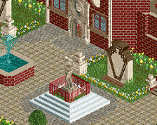
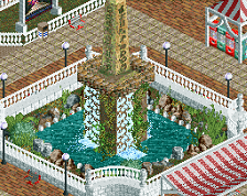
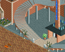
I'm bad at doing support, so I just made a blank base with block deco.
Attached Thumbnails
the undertrack was my favourite thing about it lol
Yeah, huge improvement with the paths now!