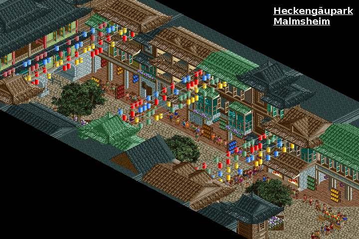
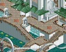
Screenshot / Mainstreet Heckengäupark
-
 30-October 18
-
Heckengäupark (Finished)
-
1 of 9
- Views 1,515
- Fans 2
- Comments 14
Community Forum Software by IP.Board
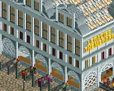
The lanterns are wonderful.
When I saw a smaller screen of this on Discord, I thought that it was nice but that the paths outside the screen would make or break it. I think you pulled it off, this is a very good looking main street! I'm pretty confident this is your best stuff ever. Do you realise how much you've improved?
Some pointers:
- Rotate the red tile paths, so the tiles run perpendicular to the direction of the street, instead of parallel.
- Architecture is very pale and dark. Add some colourful signs.
- These trees work well with the theme, but don't help with the colour problem. Maybe Chinese Cedars in a bright colour?
- Vary the interiors and things on the ground level. Just map racks, map racks and map racks? Often in pale colours too. Even if you do want to stick to just using that object, you can still make it look different in every store.
good technical points from liam. a very good screen though, easily your best. phantasialand-ish?
I'd recommend using a bit of the saturated brown to liven it up. you can make some of the poles and fences that you use as accents on the buildings this color and it'll make the whole screen pop, and improve the atmosphere. small stuff though, as I said very good already
definitely my favourite screen from you yet. Liam has some golden tips!
Map racks are on point. 10/10.
If you don't secretly take like 12 copies of the park map and all the other pamphlets and maybe one in spanish just for fun are you really a NE member
I know for a fact the answer to this is a no.
As for the screenshot, I think the archy maybe needs more color? Seems a bit dry at the moment, but I do love how it sort of stretches over the street and how cavernous it feels, nice work.
This is great dude. keep going on the up and up.
nice, getting the vibes from the golden age of facade architecture. my favorite thing from you probably. Take Liam's advice, sprinkle in pops of color with the path details and signs, etc.
Yes. Yeeees... YEEEESSSS!!
Great work V1, easily the best thing you ever made so far. I got nothing to point out, apart from the stuff Liam already mentioned. Now don't you go give up on this!
This is an awesome screen. You're improving a lot lately. Getting Phantasialand vibes from this screen. I think Liam nailed all the suggestions.
Jesus this is good....