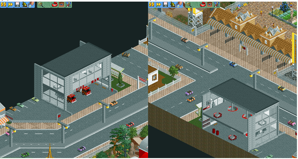
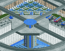
Screenshot / Playcenter | Fire Man (city)

15 Comments

  • Comment System%s's Photo
    comment below
  • Iron Rattler%s's Photo

    The fire station could use some additional color, it's a little too grey for me at the moment, but some of the shapes and forms in this screen are lovely for me. Good improvement

  • MrTycoonCoaster%s's Photo

    The fire station could use some additional color, it's a little too grey for me at the moment, but some of the shapes and forms in this screen are lovely for me. Good improvement


    I think it is better now, really was very gray
    Thx Iron
  • MrTycoonCoaster%s's Photo
    modified

    Attached Thumbnails

    • Attached Image: New Fire Man.png
  • G Force%s's Photo

    Good improvement, looks quite nice!  Good work.

  • Terry Inferno%s's Photo

    I think it would make a huge difference if you changed the station floor to a darker shade of grey, maybe a colorable path tile. It will show up more prominently against the street and the parking lot.

  • Deurklink%s's Photo

    Wow you're getting really good at this!

  • FredD%s's Photo

    Without a doubt your best work yet! The color additions to the fire station help a lot, also I love the interior of it. 

  • MK98%s's Photo
    Yes! You're getting there! Awesome improvements :)
  • ottersalad%s's Photo
    Glad to see you are putting houses on the outside of the park!!! Great work MTC
  • MrTycoonCoaster%s's Photo

    I think it would make a huge difference if you changed the station floor to a darker shade of grey, maybe a colorable path tile. It will show up more prominently against the street and the parking lot.


    You are right, I've changed color to dark got much better.
    THX Terry :)
  • MrTycoonCoaster%s's Photo
    THX all for the comments until I was + motivated :D
  • In:Cities%s's Photo

    Dark color for the bottom floor, and maybe a white/black checkered pattern for the second level.


    Fantastic work as always!

  • MrTycoonCoaster%s's Photo

    Dark color for the bottom floor, and maybe a white/black checkered pattern for the second level.
     
    Fantastic work as always!

    truth see now, I made a new screen

    Attached Thumbnails

    • Attached Image: Fire Man Path.png
  • MrTycoonCoaster%s's Photo

    I think it would make a huge difference if you changed the station floor to a darker shade of grey, maybe a colorable path tile. It will show up more prominently against the street and the parking lot.


    please to see screen - comments (in:cities)
  • MrTycoonCoaster%s's Photo

    Dark color for the bottom floor, and maybe a white/black checkered pattern for the second level.
     
    Fantastic work as always!

    according to Terry, I made the parking lot dark to create a contrast, did it get any better? so the gray floor on the ground floor got better now?

More By MrTycoonCoaster

Similar Screens

Members Reading