Screenshot / Old Town - Center Square Revamped
-
 16-September 18
-
 Old Town
-

 3 of 3
- Views 1,145
- Fans 1
- Comments 9
-
 Description
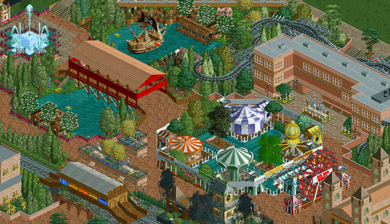
Just an update on cleaning up the mess that I had in the middle of my map project... I'm not happy with the ferris wheel... I started without it, then I felt it was missing it, not sure if it still works where it is at... and I'm not sure about the color of it either. It's irking me...
-
 Full-Size
-
1 fan
 Fans of this screenshot
-
 Tags
Tags
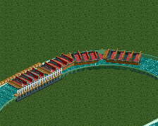
Definitely a good improvement, nice work.
MonkeyPaws Offline
Thank you so much, G!
I was going for a trim around the whole thing, I don't know if it looks the way I imagined it, but it is definitely better then the mess I had... still not sure about the ferris wheel...
Did get a new part done today, I posted it in the project page.
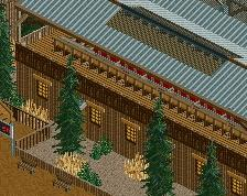
An improvent, like G Force said. I suggest getting rid of the trees around the swinger, carrousel, circus....and that other thing, and replace them with some flowers and shrubs, would make it more open and cleaner IMO.
MonkeyPaws Offline
Funny you should say that, that's what I was doing today... kinda things touching it up... but do you still like the banner trim? I thought the lower foliage would help it stand out a little better...?
...wish I could of got the flower trim all the way around it...
MonkeyPaws Offline
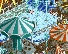
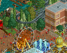
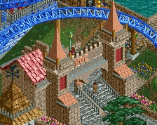
Two Crazy? LOL... so I had spent some time yesterday learning some new things I didn't know... tile inspector, invisible tracks, clearance checks... and as I wasn't happy with the location of the ferris wheel squeezed up against the middle square, and I thought it was missing it without it... I was messing around and came with this... two squeezed up into the abbey... too crazy?
Wow that centre really improved! Great to see you keep tweaking.
Don't really know about those ferris wheels; think the peeps riding it would just be looking at a stone wall.
MonkeyPaws Offline
Thanks Jene! So if I lowered the spires on the abbey, the ferris's may fit better? I kinda like them there...lol...
Here's a current shot of the middle with things cleaned up a little further... Jappy was right, removing the tall trees and putting in lower foliage really opened it up. I also made the swan track invisible, stretched the flower trim a little further, and put a path down the middle camouflaged by half gardens and half bushes with water spouts all the way up and down it.
MonkeyPaws Offline
I've been playing around creating entrances/exits with the invisible option in OpenRCT2... I tried looking for this but I didn't find it, yet, but is there a way to create a queue line without the queue sign, so I can still get a small queue line of peeps without having to have the queue line scrolling sign with it?