Screenshot / Hotel/Entrance
-
 12-August 18
-
 Wonderland Hotels and Resort
-
 1 of 5
- Views 1,806
- Fans 0
- Comments 12
-
 Description
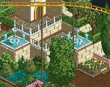
Big time fan of NE since I discovered it about a year ago. So amazing to see what you guys can build. So after a long time of just fooling around with OpenRCT I decided to try and create a proper park. First thing I build was this Grand Hotel that also functions as the entry point to the park. Looks a bit static now, but I hope to bring it more to life when I start with the foliage. Suggestions and tips are apreciated!
-
 Full-Size
-
 No fans of this screenshot
-
 Tags
Tags
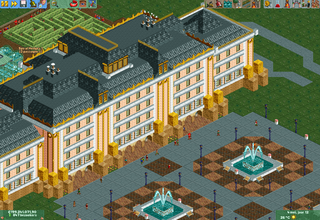
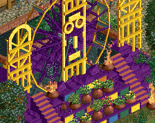
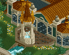
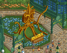
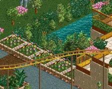
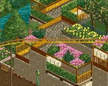
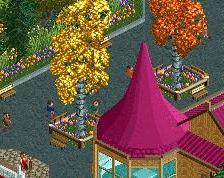
Good start! I like the colors. The paths are a bit blocky indeed. Try using two textures (not concrete) and don't mix them up too much. Maybe they need a bit elevation too.
Get rid of the Minas Thirth blocks. I think they are too blocky and they don't really add anything to the building.
Anyway, welcome to NE!
Thanks for the great comments and advice guys! I´m definitely going to have a second look at the entry-plaza after I'm done with the restyling of one of the trainstations in the park. I'm thinking about changing the Minas Tirith blocks, but I also really like the fact that they help keeping the itemnumbers down. I will decide on those after I've seen how they turn out with the foliage.
I learned a lot from them.
I loved your building and the colors, sorry, I did not like the paths.
I took another look at the entry plaza and got rid of the concrete blocks. Think it looks a lot more dynamic now. What do you guys think? Only downside are the black ´under-thingies' that appear at random. Any advice about how to get rid of those?
this is amazing! A few more small path details here and there like lamps, benches, little stalls etc. and it's perfect for me!
Welcome to NE, dude, can't wait to see more!
Love the updated screen. There's something slightly RCTNW about this, but with more warmth.
The big planter with the track is awesome!
Welcome to New Element! Loving the debut screen and hoping to see more of you soon! Good to see you listen to advice, really like the improvements you made to make the initial work even better already.
Great intro to the site! Version 2 is a fantastic screen, great improvement with the path change!