Screenshot / Maverick
-
 29-July 18
- Views 3,054
- Fans 1
- Comments 12
-
 Description
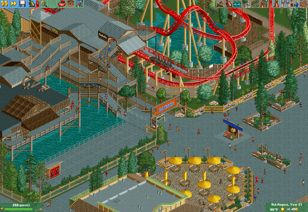
Recreating Maverick from Cedar Point. I’m pretty new to OpenRCT2 so I know this isn't the greatest thing ever. lol. I played the original RCT games as a kid but got back interested in the game about a year or two ago once I found this website. I finally put something together i wanted to share here. I know that it isn’t the best but I hope it’s decent. Would love to hear your thoughts on this!
-
 Full-Size
-
1 fan
 Fans of this screenshot
-
 Tags
Tags
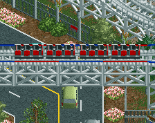
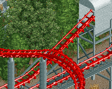
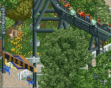
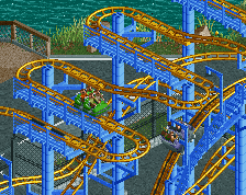
Not sure how much you're looking at reference images, but definitely try to squeeze every bit of color and detail out of the area you can, it definitely would help.
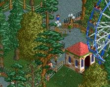
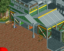
yeah that is a pretty excellent first screen. foliage could be a little 'tighter' in execution perhaps- its a bit bare and plopped randomly atm. I'd also consider the scale of the station slightly- it feels a tiny bit squat and the grey flat roof isn't doing wonders with all the gray paths around. but seriously solid entry to NE!
Don't be afraid to embellish colors a bit, as G Force alluded to, even if it is a recreation. A great first screen for sure, looking forward to more! It's definitely decent, that's for sure, pretty good I'd say!
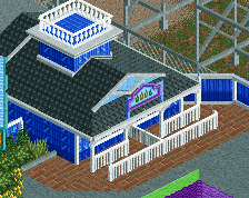
Snack bar well laid out the tables, the fence around the snack bar got very good and the stone path in the snack bar stood out nicely.
I can not say much, I'm not an expert, it was nice for me.
This is some great work already, and for a first screen this is even better. I echoe the rest about adding little colour accents around the place. The fences in the overflow queue are a good example, I nearly didn't see them as they blended in so much with the path. Add some signs, banners, perhaps some more of those vending machines, flowers... Maybe some trim on the walls and roofs as well to add some colour?
BTW, welcome to NE, hope you stick around as this shows serious skill.
I'm pleasantly surprised of this recreation attempt. In fact, I had plans myself on making a RCT2 recreation of Maverick, but it became a Nolimits 2 Recreation instead. Hope to seeing the completed park soon. Oh, and welcome to NE. Your skills could make you become one of the best here.
Odd choice to replace the trees breaking up the outdoor queue with more concrete. It's way more aesthetically pleasing in real life.
Generally though I like this.
Thanks y'all for the suggestions, I'll try to upload this recreation by the end of the week.
Amazing work overall but feels a bit to cold and grey for my taste. I think changing the grey queue could help !
Rather than rushing it, spend time refining it and make it the best it can be. It looks promising (especially the ride area) but the rest can really make it something special if you take your time with it.
Try to break up that concrete a bit. I know it's a re-creation but there are ways to make it less overpowering.
I actually had about 90% of the whole thing done when I posted this screen. I wanted to post a screen of something just to get any final suggestions about it. I already redid the outdoor queue and made it more colorful. I’m just gonna add some extra stuff to the buildings and such and then I should be done.
The first bridge part of the queue is dark wood. Just a little detail to make it more realistic.