Screenshot / FUCK II update year 0
-
 29-July 18
-
 FUCK II
-

 3 of 4
- Views 1,836
- Fans 2
- Comments 16
-
 Description
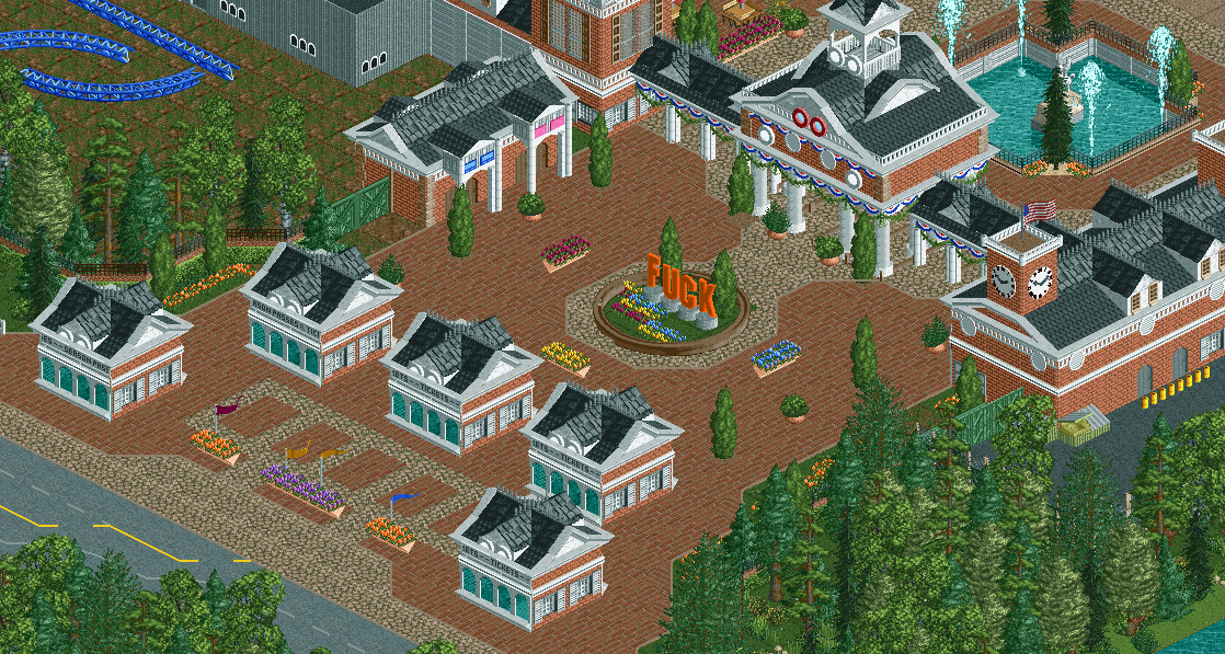
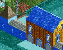
Construction is moving along nice and steady. The entrance and the entrance zone with the ticket boots and the gates to enter the park are done. The room what will later on serve as 'Guest reception' is now being used as an information center for the neighbors. Everyone who has questions or concerns are welcomed there.
"We noticed a lot of neighbors coming in and that our info center did take away most concerns and complaints about our project. Not all of course but we are on the right path to a healthy relationship between the Climax community and us." FUCK director Fred spoke.
Dick Power is one of the neighbors who is calmed down after visiting the info center. "We didn't know what they were up to and when we came, they were very friendly to us and explained all the stuff they wanted to do. I'm most happy with the fact they are keeping the promise to not touch the pound and let our children play in it. I'm not so worried anymore but we'll see. They have optimistic predictions on how the traffic will be. I'm not so optimistic so I hope they will make adaptations when they notice their predictions won't be met."
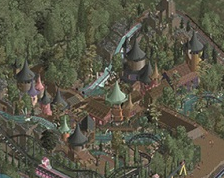
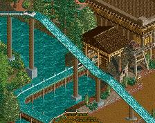
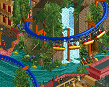
The park confirmed there's already one ride built. Coaster enthusiasts noticed the delivery of the first coaster track pieces. They are blue and fans expect the coaster to be manufactured from either Intamin, Mack or Gerstlauer. The park however doesn't want to publish any information about the coasters they are going to build. "We are still planning some of them and are having negotiations with different manufacturers, so we can't say anything about it right now." -
 Full-Size
-
2 fans
 Fans of this screenshot
-
 Tags
Tags
Nice work though, probably one of your best screenshots.
If I do not understand, please someone clarify me.
Fred's Ultimate Coaster Kingdom
F.U.C.K
thx
the tower with the clock is good, the green gate i liked
water fount, I think it is a square right? liked it
Yeah good work
Who let G Force into fred's account
Don't be silly, I would never use round doors or use this tree combination.
i think the mud/grass in the top left is ruining your vibes. put a clean row of trees behind/ in front of the fence there and have a more detailed backstage maybe?
I like the arrangement of the buildings and the overall feel, but not sold on the brick buildings plus brick path. Maybe something less busy for the paths would work better here. I love the entrance sculpture, did you make those objects, or are they around somewhere?
Oh the humanity,
The elaborate theming in the entrance plaza is impressive. I truly can not wait to see what this park has in store.
What else did you expect from me
Oh yeah didn't thought about benches/etc yet there. Will add those ofc. There were q-railings in a previous version but since I changed the ticket boots I forgot to re implement them.
Good point!
I like the brick path, otherwise it would be only crazy path and I can't think of any else fitting path style besides grey concrete which I don't like. Those letters are objects named 'Hollywood letters', they are in NE's object database (here: https://www.nedesign...ts/?q=hollywood )
Very nice. I really like the moulding work. Normally, I'd think orange would be a strange colour choice for the sign in this setting, but it seems to fit well here. Odd glitch with the tree by the main gate - is that fixable?
Nice stuff Fred ! The part with the giga tracks feels a bit empty but otherwise it's amazing. Are the "fuck" letters yours or is there an available full alphabet to download somewhere ?
lolz. Why does no one read the whole thread?