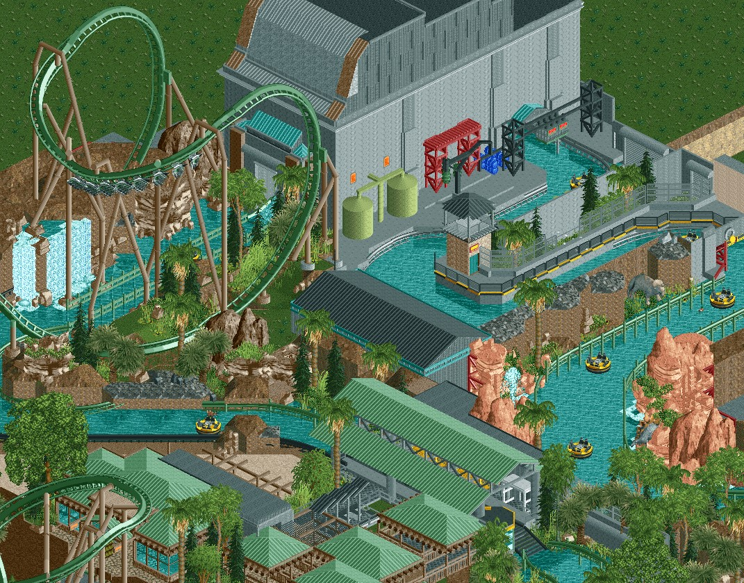
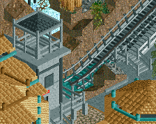
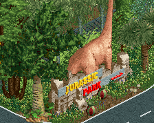
Genius element mate, love to see new inversions and that's a killer one! Overall very nice screen, however would pop in some more color, it's looking a bit dull right now imo. Maybe changing the coaster color to a brighter one would help too?!
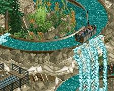
That coaster looks indeed quite sick. Sad it's green and brown like a lot of the surroundings, which makes it less highlighted as i would prefer it. The rapids are also technically quite well done, loving that black and yellow fence.
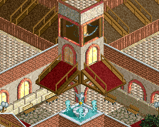
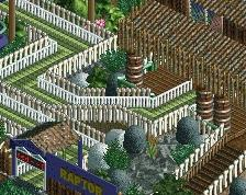
Foliage and Landscaping is also very well done! Looking forward to more!
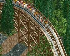
Joking aside, this is great. I like all the green and brown, feels very junglelike. Agreed with alex on the floor texture, some kind of darker grey would work really well imo. Maybe that dodgems base texture?
The element is fucking great but yeah, bad idea making the coaster green. Never understood why people do this; it’s incredibly dull.
Not sold on the stuff with the river adventure to the right side. Very grey with not much going on and it kind of just zig zags around. I think making things more lush within that small space could solve this easily. Otherwise, I think you could stand to be more creative here. At the very least make the main structure larger, more interesting, and a shade of white. Also kind of a shame no guests can see that splash down?
haaaa I'm sad , I was building a JURASSIC PARK too, hehe. I am with 3 projects, it depends on the inspiration I go to that park or to another park. I love these prehistoric themes, good work
The coaster colors are fine, but perhaps the archy in the middle could have a bit more color infused into it. Great stuff tho, love what you're doing here.
Yeah, great element. And I've no problem with any of the colours. I can see the coaster clearly enough, so I don't see why it needs to stand out, and Jurassic Park always had a natural/industrial feel, so I think the muted greens and greys fits this well. The colour you have got seems just about right, I'd say.
 28-July 18
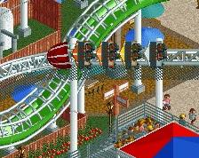
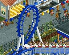
Wow thats a sick element on the flyer. Great screen!
Yeah that element is beautiful.
I think you maybe need a different floor texture where all the grey stuff is. It looks a bit crude right now but maybe its just unfinished.
Genius element mate, love to see new inversions and that's a killer one! Overall very nice screen, however would pop in some more color, it's looking a bit dull right now imo. Maybe changing the coaster color to a brighter one would help too?!
That coaster looks indeed quite sick. Sad it's green and brown like a lot of the surroundings, which makes it less highlighted as i would prefer it. The rapids are also technically quite well done, loving that black and yellow fence.
Foliage and Landscaping is also very well done! Looking forward to more!
https://www.youtube.com/watch?v=-w-58hQ9dLk
Joking aside, this is great. I like all the green and brown, feels very junglelike. Agreed with alex on the floor texture, some kind of darker grey would work really well imo. Maybe that dodgems base texture?
Wow im going to steal that inversion. Very Very awesome
Not sold on the stuff with the river adventure to the right side. Very grey with not much going on and it kind of just zig zags around. I think making things more lush within that small space could solve this easily. Otherwise, I think you could stand to be more creative here. At the very least make the main structure larger, more interesting, and a shade of white. Also kind of a shame no guests can see that splash down?
@replacements, when do we tell them
I am with 3 projects, it depends on the inspiration I go to that park or to another park.
I love these prehistoric themes, good work
The coaster colors are fine, but perhaps the archy in the middle could have a bit more color infused into it. Great stuff tho, love what you're doing here.
Yeah, great element. And I've no problem with any of the colours. I can see the coaster clearly enough, so I don't see why it needs to stand out, and Jurassic Park always had a natural/industrial feel, so I think the muted greens and greys fits this well. The colour you have got seems just about right, I'd say.
Love that giant inversion and the support work too. Just wish the coaster was more colorful to be honest. Can't wait to see more.