Screenshot / Plaja Delfinilor - Strada De Plaja
-
 22-July 18
- Views 1,843
- Fans 0
- Comments 8
-
 Description
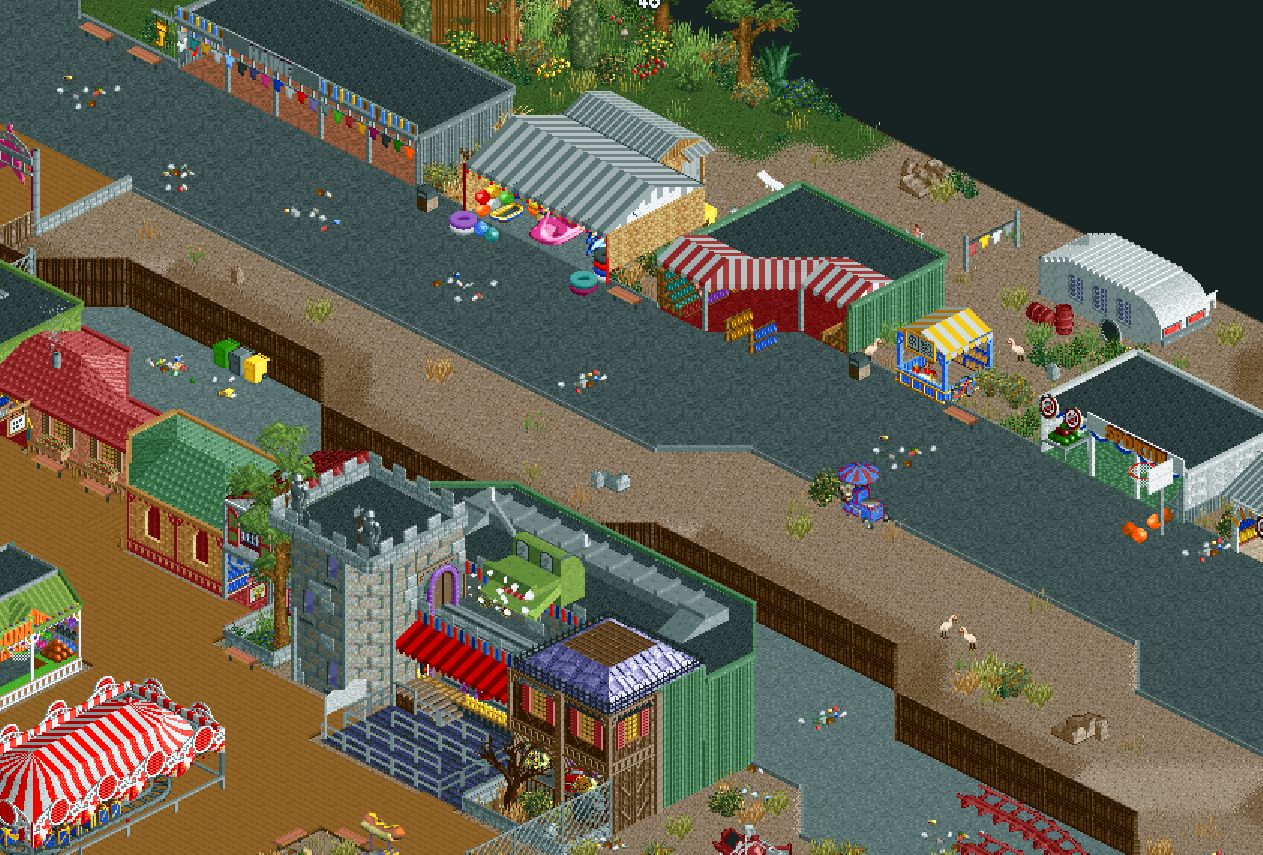
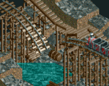
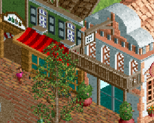
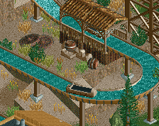
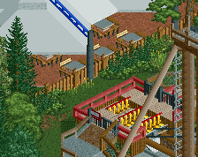
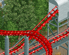
Finnally posting on NE again, for a long time I couldn't find inspiration or motivation, but a few days ago I started work on this small Romanian seaside park.
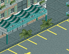
Strada De Plajă is a pathway by the shore of the black sea, the street is always packed with people, as the nearby hotels attract tourists. Because of this, many vendors set up shop here, selling food, drinks, souvenirs, etc.
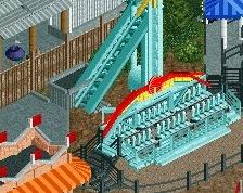
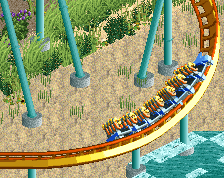
But the main attraction is Luna Parc, the small seaside amusement park located on Plaja Delfinilor. -
 Full-Size
-
 No fans of this screenshot
-
 Tags
Tags
great start.. looks really good so far.. maybe add more detail to the paths like benches and stuff. The haunted house ride is the highlight here
Yeah, very good start and significant improvement! I like how you're developing an eye for little details. As a result this scene looks pretty lived in, which is crucial if you want to become a great realism parkmaker.
Still plenty to learn, on the macro side of things, I'd say. I don't really like how there's an empty strip of land between the two roads shown in this screen, with an ugly (from the peeps perspective) wooden fence and rear facades. You can use the space here more optimal. I'd put more of those tents and stalls like the inflatables thing and the caravan on this side of the path too. Get some food trucks in there.
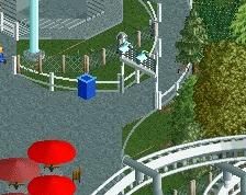
Detail: concentrate the trash in corners and along walls, not in the middle of the path. Especially in a windy environment.
That haunted house looks veeeery familiar....
https://www.nedesign...-haunted-house/
Pretty good stuff. Definitely listen to Liam's tips abotu detail and trash.
I liked the stalls
It was good the details
That caravan looks really cool. You've improved. The foliage above looks good too as far as visible. Listen to mr Liam and keep practicing!
Well at least Thibo did it better...
JK.
This is pretty cool, really unique. Will probably look a lot better with a tons of peeps in there, you really should add those soon.
@Liam
I followed up on your advice, looks much better now!
@Jappy
Your Bumbly Beach was a huge inspiration for this whole park.
@Fred
The "JK" makes me unsure if it's a compliment or not...
Thanks to everyone else as well!