Screenshot / Introducing Talon
-
 21-July 18
-
 Talon: Grip of Fear
-
 1 of 3
- Views 3,128
- Fans 2
- Comments 18
-
 Description
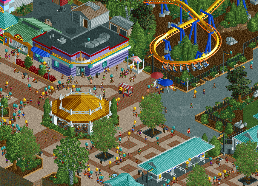
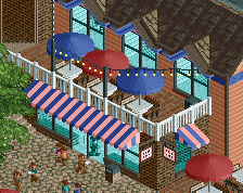
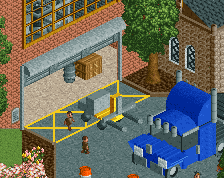
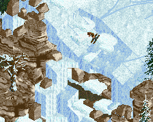
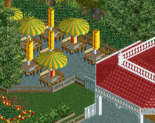
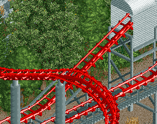
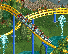
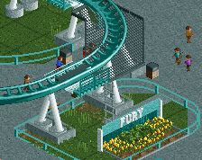
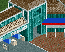
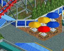
My next recreation project is coming soon, and I've finally gotten enough of a finished screen together to post.
Introducing Talon, a recreation of the coaster of the same name at Dorney Park in Allentown, PA.
Comments/critiques/suggestions welcomed as always. -
 Full-Size
-
2 fans
 Fans of this screenshot
-
 Tags
Tags
SO good. Proud of you dad.
Lively and fun, bold move with the landscape under the coaster, I think I like it.
This is great. Love it!
Looks fun, great pathways going on. Think you went a bit overboard with that texture under Talon, bit too much for me. Curious to see more!
What a beut!!!
H2H did you good! Great work filled with detail and life. But I'm not a fan of the texture under Talon tbh.
The paths were nice, good combination, I love colors these brown/beige they look good.
The screen on the tree was perfect.
The bin combined with the path.
The stripe on the walls is good.
+ print screen please, if possible.
As I said earlier, no sense of realism here. There should be like 4 people on the train and nobody on the midway.
Great work though. lol
I think the foliage can be improved quite a bit, especially under the coaster, feels a bit rushed maybe.
As a whole could benefit from a bit more refinement, in order for this to stand out I think that aspect needs to be strong, at least for me. Sure its atmospheric but I don't know if it really does much for me outside of that. Color are good though, as is the custom carousel, nice change from what we usually see.
Thanks everyone for the compliments. This has been loads of fun to build, glad people are appreciating it.
G Force, the foliage is probably the one thing I'm personally unhappy with in this screen (and with the design in general atm), some of it will get bulldozed. Probably not gonna change the repetitive bushes along the path edges though, that's imo an important aspect of the real park that I don't want to deviate too much from.
As far as refinement goes, what really are you referring to? More detail on buildings, better object use, that sort of thing? I've got some of that already planned, but if you have particular things, I would greatly appreciate a DM with your thoughts!
Good stuff; has hints of Knoebel's as well as your H2H improvement showing which is interesting, not necessarily a bad thing either. I think the brown landblocks in the mulch bed need something to help 'ground' it as it looks like it's floating a little bit. That could be something like flat texture blending or rocks, but I think it could use something.
This is the best Falco di Ferro recreation I've seen so far.
Love seeing my PA parks recreated. Do you plan on doing Hershey, Kennywood, etc.?
I’ve done Knoebels, check it out on my profile.
Navalin is doing a Hersheypark rec, so I won’t be doing that one out of respect for his, which is looking good and I’m really looking forward to.
Others are possibilities in the future, but who knows when.
Oh trust me I have. Loved exploring it in RCT2 form. Waldameer is a cute little park in Erie which may be an easier one to tackle. Sad I won't see Steel Force or Hydra in here, but great work nonetheless!
The hardest thing about DP is the scale doesn't relate to rct... at all. You have to find a way to meet in the middle. For example, your carousel structure is too small and not attractive enough among the midway as well as the midway buildings. Your path along the midway is spot on, (but as I said to you before) I wish rct came with a loop that was between the small loop and large loop (which throws your Talon off). The corkscrew over the the section where the drop meets the loop is the bitch of the ride. How you have it seems too forced, and should be equal to the carousel structure. You also have to have the top of the helix angled at its peak so it glides into the final drop before the brake run. Even though you do get some airtime, you do get turned about since it's an invert. I had a season pass since I was 6 and worked there for 5 plus years so please let me know if I can help you some more. I always thought if I did a DP recreation I would be my last rct project ever, because the park is so off scale... and the coasters are extremely hard to perfect. I love the effort though, keep at it
-JDP
JDP, I agree about the carousel building, I think. It seemed okay when I first started, but now that this design is getting more full, it could be more of a focal point. As for everything you mentioned for scale, it's all been considered. The grid structure of RCT makes it difficult to "line things up", especially since the lift hill of this coaster is about 20 degrees off of being parallel with the midway.
Recreations are all about balancing real life and in-game aesthetics, and I think I've done a good job of that in this case (definitely better than my past work, which tipped the balance towards real life accuracy). It's definitely not going to be perfect to real life, but I find getting as close as possible within the limits of the game a really nice challenge for me.