Screenshot / B&M Sit down #5, Streets,buildings...
-
 17-July 18
- Views 953
- Fans 0
- Comments 4
-
 Description
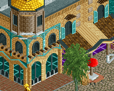
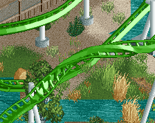
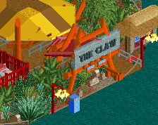
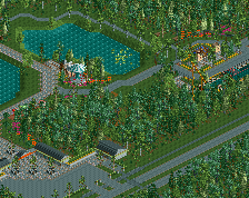
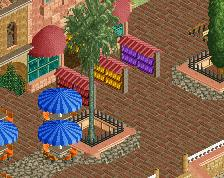
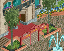
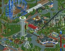
This Design is nearing completion(around 75-80% done!) and i'm quite happy with how its turned out. The whole thing has been a learning curve but i hope i've shown i can do higher quality work. For this screen im showing the main street/ the lead up to the ride, hope you like it and as always feedback is loved <3
-
 Full-Size
-
 No fans of this screenshot
-
 Tags
Tags
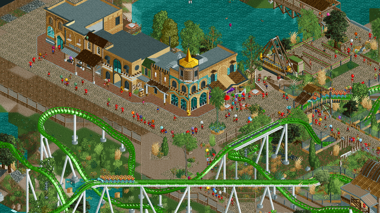
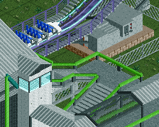
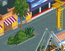
I would suggest to make the flat roofs black instead of grey. I know they are grey in real life, but black just looks better in RCT.
Try to make sure more is going on at the bottom floor of those facades. Add some details to give the buildings a purpose.
Also I don't really like how you closed of that cool waterfront for the public.
Rest is good.
The facades could probably use some refinement, just try to add that extra level of detail to make them feel real. Also, not sure you need a big sign that says Bathrooms, lol. Something a bit more subdued would suffice.
I'm not sure the beaten up path is really working as you intended. It looks quite unfinished as is; maybe a few more bushes here and there? Your guests are also hopping the fence!
Otherwise, you're on the right track.