That's a lot of paths. A sea of paths. And I think you made it miraculously work! I love how the whole square is lowered. You only need to lower the water in the middle as well, and add a fountain or something..
What if you put some a garden of sorts in each of the dark grey squares? Or you could try some different path types to break it up a bit. You could also try increasing the size of the central fountain a bit.
I'm really interested in how this would look like when the foliage is done, as that's clearly the weak spot here. I'm not a fan of the objects you use for flowers, nor the dull green colour you used for them and the bushes. Also, try to make patches of foliage instead of these scattered foliage objects. If you're having difficulties with this, do some foliage research on the top rated parks on this site.
That's a lot of paths. A sea of paths. And I think you made it miraculously work! I love how the whole square is lowered. You only need to lower the water in the middle as well, and add a fountain or something..
Those buildings look very nostalgic and cute! They bring a good atmosphere. But yeah the square is a bit too big to my taste.
Loved the Kart, the colors of the paths made it nice.
The houses are beautiful, good work
What if you put some a garden of sorts in each of the dark grey squares? Or you could try some different path types to break it up a bit. You could also try increasing the size of the central fountain a bit.
Otherwise, good stuff all around!
that sea of path is great. very original
Interesting stuff. Still haven't decided wether I like it or not.
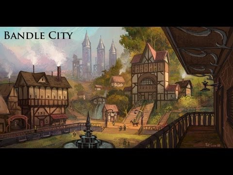
Thanks for all the feedback everyone. The reason for the sea of path is because I was trying to recreate this old image of Bandle City
I hope you do Ionia!
Ionia is still a work in progress. just need to add the foliage and benches and stuff. Really looking forward to showing that one here
I'm really interested in how this would look like when the foliage is done, as that's clearly the weak spot here. I'm not a fan of the objects you use for flowers, nor the dull green colour you used for them and the bushes. Also, try to make patches of foliage instead of these scattered foliage objects. If you're having difficulties with this, do some foliage research on the top rated parks on this site.
Shout out to whoever changed the thumbnail on the homepage. Much better