Not sold on this palette. It's interesting, but not sure it really sells a 'horror' concept and the extreme contrast makes it harder to read a ton of the details in the screen.
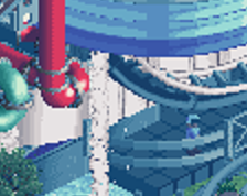
Everything except the palette looks great. The palette is way too blue. I can appreciate what you're going for but something less saturated would work better.
 24-June 18
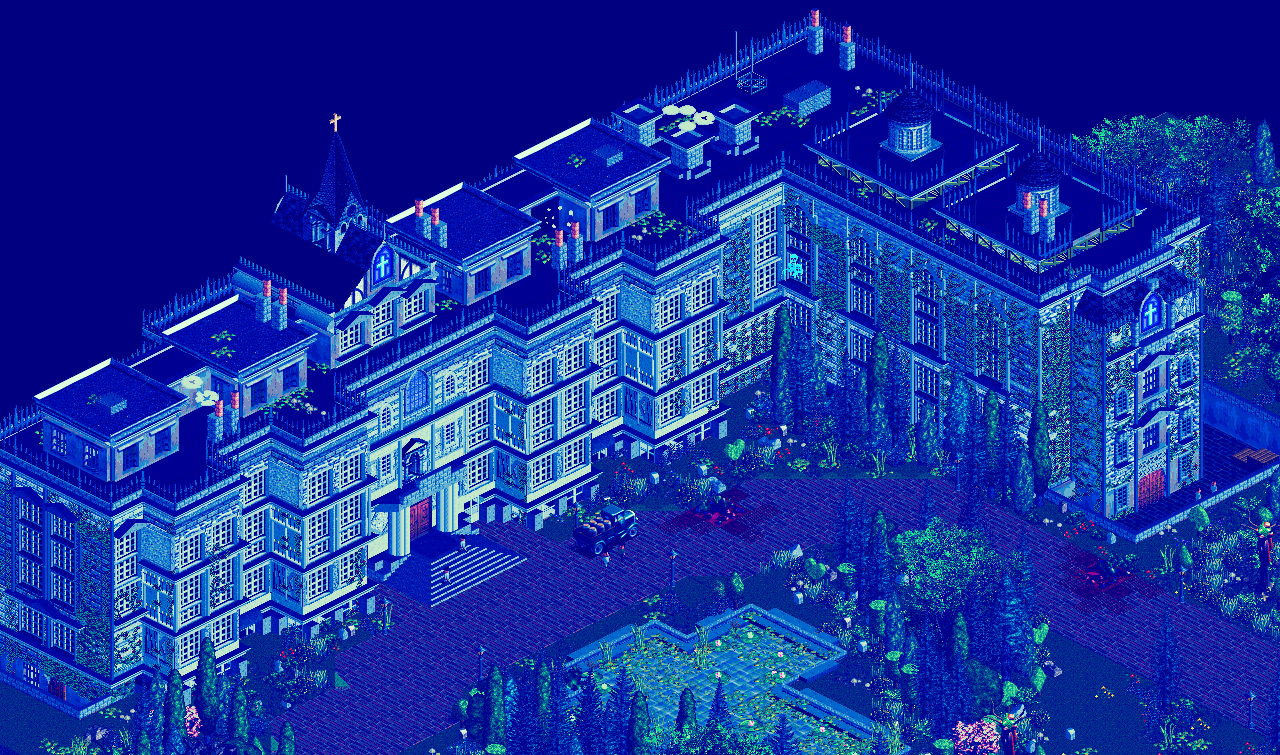
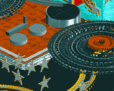
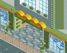
Excited for a horror theme...palette looked cool at first glance but I'm not sure it sells the concept of horror.
Not sold on this palette. It's interesting, but not sure it really sells a 'horror' concept and the extreme contrast makes it harder to read a ton of the details in the screen.
Building is nice, for me nice work, but this blue looks strange
I'm not a fan of the color palette (and it seems I'm not alone), but man, that building is SPECTACULAR!
Everything except the palette looks great. The palette is way too blue. I can appreciate what you're going for but something less saturated would work better.