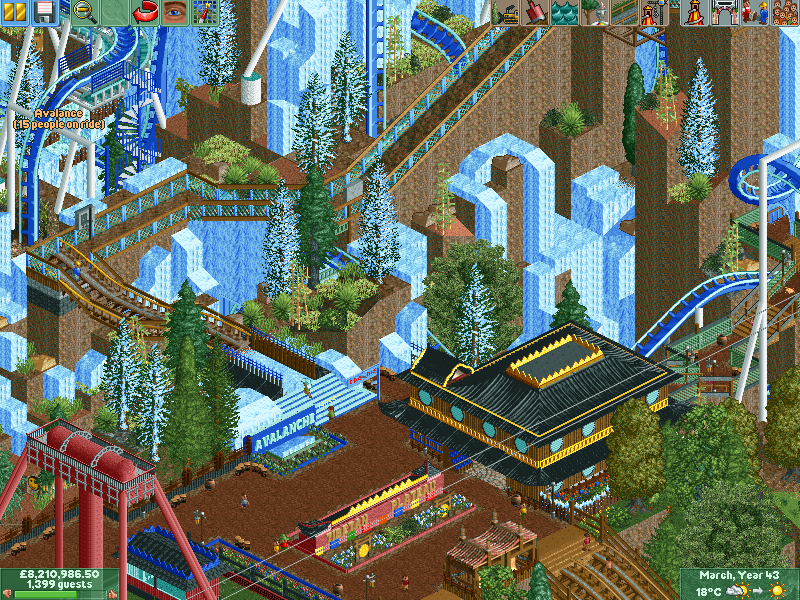
I think this screen deserves some replies! Like your other screens, this shows a lot of promise. You've got some good ideas and skills, but need more refinement and cohesion to make it all really shine. The landscaping in the bottom right corner for example could use some work. The long architectural sausage (I don't know what to call it, it's the thing with the gong behind it) seems weird from this angle, I can't tell what it is, and the way it sits on the path it creates an unfortunate bottleneck between the sausage and the frisbee ride.
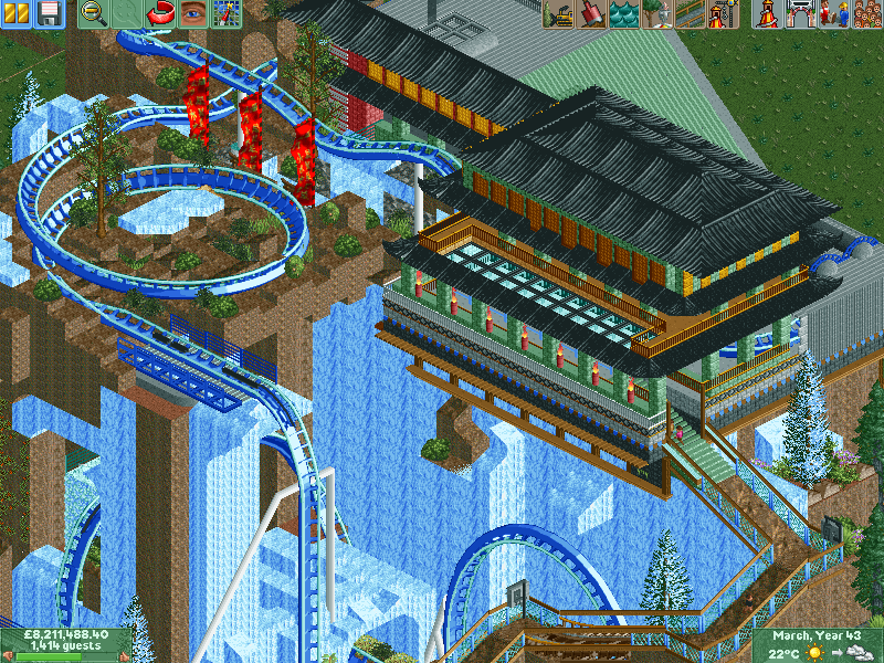
Thanks for your input. Its my first time creating a park with hacks so its all a bit of a learning process. it probably looks weird cause the station is up on a hill. This is what it looks like from the other side. That sausage is actually a sign!
I think this screen deserves some replies! Like your other screens, this shows a lot of promise. You've got some good ideas and skills, but need more refinement and cohesion to make it all really shine. The landscaping in the bottom right corner for example could use some work. The long architectural sausage (I don't know what to call it, it's the thing with the gong behind it) seems weird from this angle, I can't tell what it is, and the way it sits on the path it creates an unfortunate bottleneck between the sausage and the frisbee ride.
65%!
Thanks for your input. Its my first time creating a park with hacks so its all a bit of a learning process. it probably looks weird cause the station is up on a hill. This is what it looks like from the other side. That sausage is actually a sign!

This is actually really interesting. Nice landscaping; needs a bit of refinement though. Avalanche in game is missing a 'h'. Can't wait to see more!
very nice. i like the path on the crest. keep it up!