Screenshot / Nightmare
-
 21-April 18
-
 Briarwood Farm
-

 2 of 2
- Views 1,519
- Fans 0
- Comments 8
-
 Description
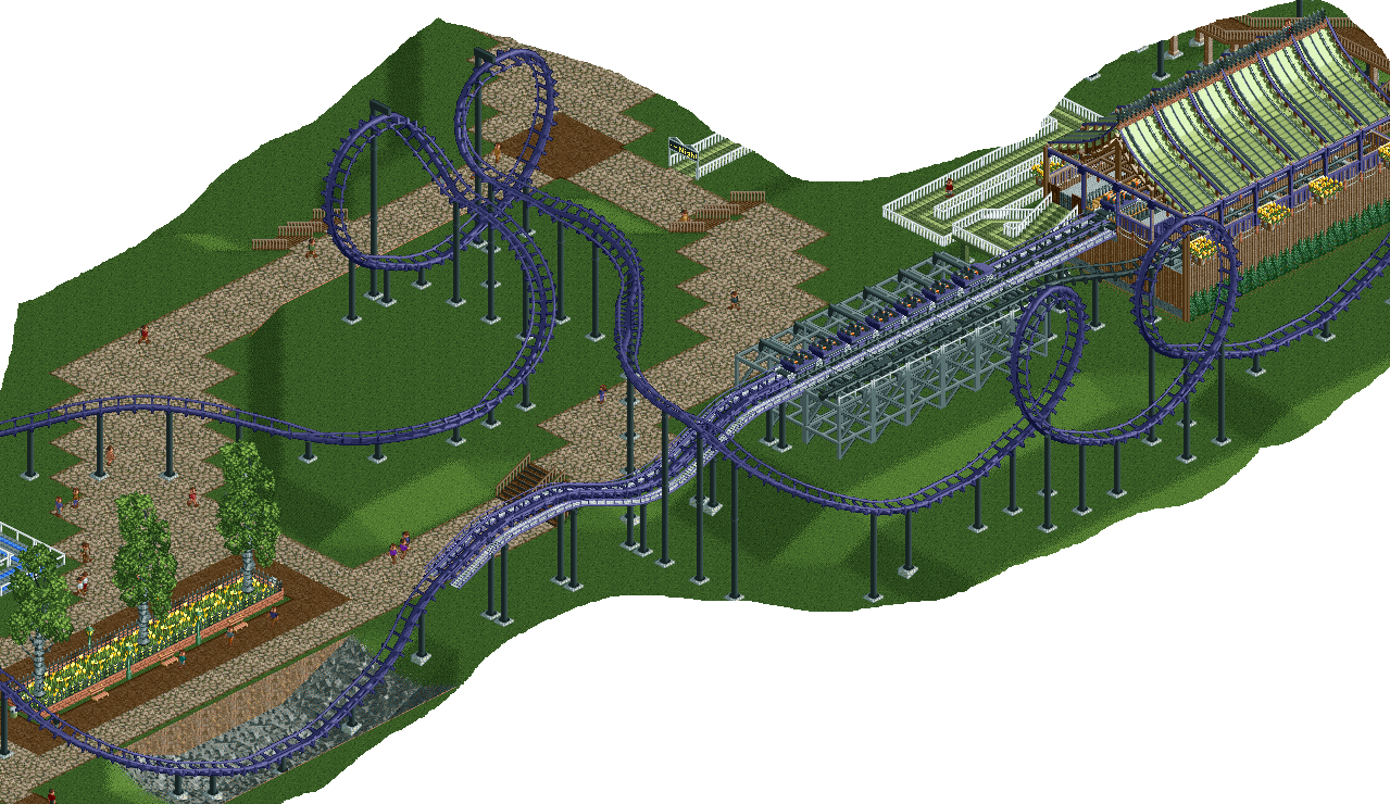
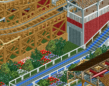
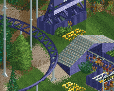
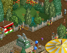
I'm not very good with foliage and have been looking up some screens for inspiration, so this area is still a WIP very much so, maybe only 20% done. Was also looking to get some feedback/ideas there.
Diagonal paths are a hassle in RCT, and I'd like to stick with NCSO, so pointers there would be helpful too. -
 Full-Size
-
 No fans of this screenshot
-
 Tags
Tags
It's a great start, fantastic even, but woefully unfinished
link to foliage tutorial
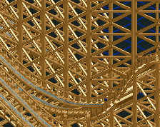
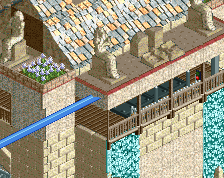
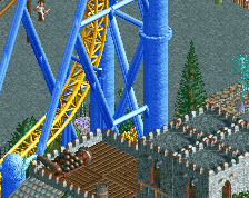
Great start - I too fell into the trackitecture spoof. There's no need for it here. If you can make a more enclosed (or less enclosed, depending on your preference) station without trackitecture, it may end up looking better.
Great work, though. I love that layout!
I'm going to keep it for this coaster, cause it's simple unlike most of the trachitecture we see on this site. I got good feedback on it last time so I understand that everyone won't like it. But I do not plan on using much on this project, so stay tuned!
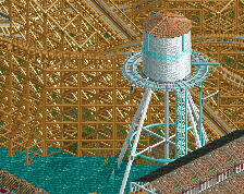
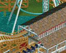
Also, I'm planning on taking this bad boy and its water tower out of retirement and am gonna try to make a full park out of it:
https://www.nedesign.../1941/progress/
You got the interactions with the path just right. Keep those. I think they're good. The trackitecture feels a little unnecessary here though.