Screenshot / plopkoeken en smurvenijs
-
 24-December 13
- Views 1,730
- Fans 0
- Comments 4
-
 Description
hey guys! so i've pretty much given up on the other dutch park, and i'm now making another dutch park, only this time not extremely dutch just some small references like names and rides, all that aside i hope you guys like it and feel free to give your critiques
-
 Full-Size
-
 No fans of this screenshot
-
 Tags
Tags
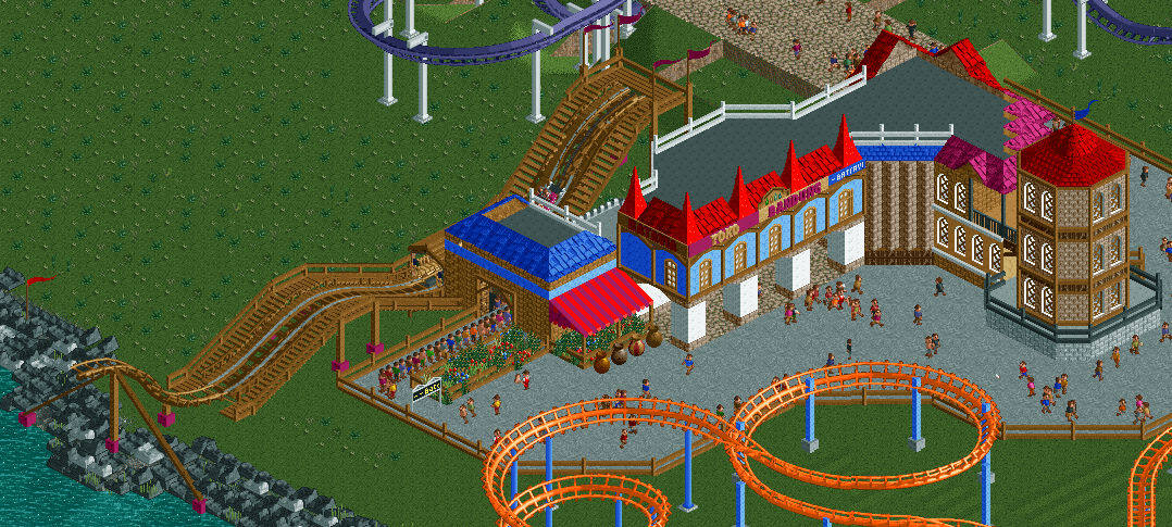
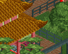
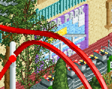
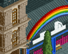
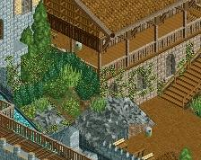
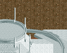
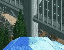
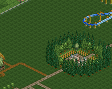
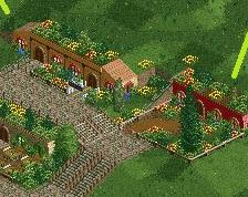
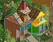
this is a small area for kids btw. will add other kids rides soon
If it isn't "extremely dutch", as you say, but only Dutch because of names and rides, then I don't think it really qualifies as a Dutch park (i.e. any other park with Dutch names is not a Dutch park just because of them). If, however, it is influencing your building style, then by all means use it as a basis for theming. Otherwise, It might be useful to forget that idea completely and just build as you wish, without restrictions.
About the screen, I think the unusual shapes of the buildings definitely adds interest to the area. Perhaps more depth variation on the walls would really help them pop. I'm not too sure about the rocks along the coasts. I think a wider selection of different shaped ones would break them up a bit, and a less linear cut off point would make them look more natural.
thanks for the tips. as for the rocks i got the idea from the rocks that are used to protect the shores around where i live agaisnt high waves or storms, they're black so that's where i got the idea from, i don't know what to do with it otherwise.
but now for the building of the kiddie coaster, how could i do that, what colour, i had really no clue what to do there and i think we can all see it
Not that I can say much because I haven't built anything in quite a while...... BUT, I think you should build a sort of "pier/walkway" thing, Rather than just have a dead end there also you could connect it to the crazy pathing path going through the blue building right.... Also add some planters/stalls in the path to break it up and that diagonal brick "WALL" try and improve that maybe with awnings and by making it somekind of shop. If not i'd remove it because its ugly as hell.