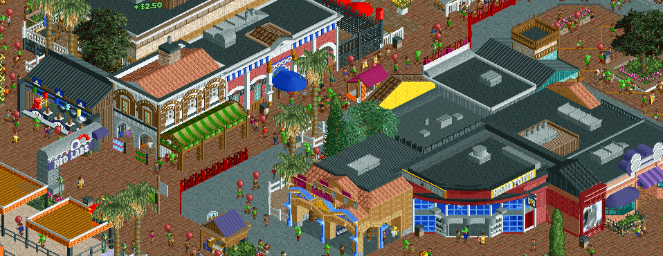
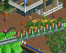
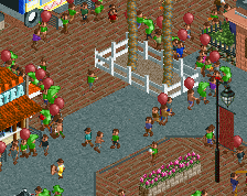
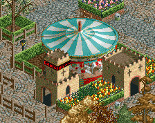
Screenshot / Western's Frontier Entrance Shops
-
 29-March 18
-
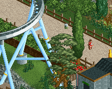
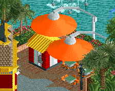
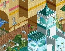
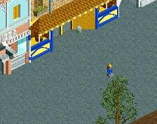
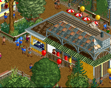
Western's Frontier
-
4 of 5
- Views 1,755
- Fans 0
- Comments 9
Community Forum Software by IP.Board
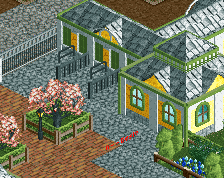
Nice little cluster of buildings, you have good variety. I find the transition of the grey to brick pathways a little harsh... maybe change the grey???
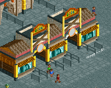
Also, what is that picture in the bottom right? A coffee cup?
and you haven't signed up as a replacement why?
Lovely work, mate!
i dont know what the theme is, but its super lively and fun. good detailing. one tip- i wouldn't 'sink' the roof into the crown moulding like that- have it start just one tick up so that doesn't happen
Some of the scale on these buildings feels a little off, maybe one unit too short in some places? Overall this is really nice. Good use of color.
+$2.50
I kinda dislike the randomness this has but it also feels new and refreshing, which for sure is a good thing.
Looking good!
composition is really nice!
The buildings look great. I really enjoy the good amount and variation of details. Give it a really fresh atmosphere. I'm not sure about the dark red fence between the paths though. Otherwise great stuff