Screenshot / Thunderbolt
-
 25-February 18
-
 Bethlehem Steelworks
-

 5 of 10
- Views 2,807
- Fans 0
- Comments 21
-
 Description
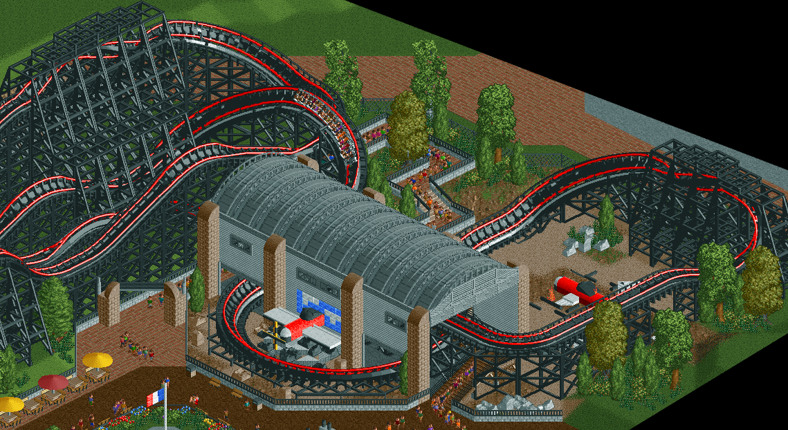
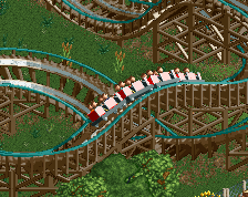
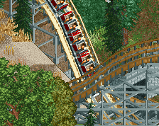
"Ride the skies above Normandy in Thunderbolt, the latest attraction at Bethlehem Steelworks! This all-steel RMC coaster will be sure to thrill you, with a vertical drop of over 120 ft and 3 exciting inversions!
In the queue, learn about how Bethlehem Steel provided engine parts for Allied aircraft, including the engine blocks for the P-47 Thunderbolt, the coaster's namesake."
Some unfinishedness in the upper and lower right portions of the screen, but thought this was fun and wanted to share it before H2H begins! -
 Full-Size
-
 No fans of this screenshot
-
 Tags
Tags
Very cool! Love the plane in the helix
Pretty dark theme! But like trav said pretty nicely done. That plane is great!
Station is cool, as are the custom planes. Overall shape is a little simple though, maybe through in an adjacent tower similar to the ones you find at small airports? On a smaller scale of course. Just something to spice up the slight squareness of the structure.
yeah i definitely think that it needs to be a lighter colour.
Maybe it's because I'm only seeing a small portion of the layout, or because it's an RMC in RCT2, but something about it is... off. I'm not really sure what though, it may just be the color.
I like this a lot, but it could benefit from a brighter color.
the black is ugly to me, everything else is lovely
Sooo.. black. And massive.
I'd consider a more natural wood color as others have mentioned; finish up the area with some more details and you'll see the score increase by at least 5-10%.
( ͡° ͜ʖ ͡°)
I dunno, it looks good, but I think there's just too many limitations in trying to make an RMC right now that hinders it
I agree about the colors, and Steve made a great suggestion with that tower, otherwise great stuff! Keep it up!
Thanks all. I wanted the coaster to specifically not look like a wooden structure (due to this park being steel-themed and all. I tried grey in the beginning, which would be more realistic (think Wicked Cyclone at SFNE), but it looked like crap.
Coaster is brown now, with some purplish-pink rails. Will post an update screen later.
I would maybe change the elaborate support structures you have there to a custom-made one. It's more work, but I think it will pay off in the end. Also add some more vertical elements, like the tower Steve suggested.
Here's an update. Hope you all like it better, I do.
Personally I thought that the black looked fine. Might not want to ride it on a hot summer day, but I prefer that to the current wine country look. The tower is a nice addition, though.