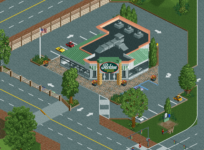
Screenshot / Who wants some Perkins?
-
 16-February 18
-
 Bethlehem Steelworks
-

 4 of 10
- Views 2,588
- Fans 0
- Comments 20
-
 Description
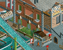
"Why eat expensive amusement park food when you can have some good old-fashioned down home country cooking, with fresh-baked desserts to boot?
10% off your bill with a Steelworks Ticket"
Thanks to Coasterbill for the sign over the entrance, since he's awesome and the master of sign making. -
 Full-Size
-
 No fans of this screenshot
-
 Tags
Tags
10/10 Great sign. lol
^ Agree
I've not been the hugest fan of Perkins, but having been to one a couple times, it appears to me that this is just like one. Well done nailing the look!
My only suggestion is to perhaps look into adding cars to the streets. It'd help the feel of it.
Good work, Sax!
I think there should be something to break up the transition from parking lot to retaining wall, perhaps more grass.
you started to give this screen the amount of context and depth it needs, but you're definitely not done yet. i could put a 1-tile foliage buffer between the parking lot and the elevated road. it has fundamentals for being a great realistic scene but it's lacking that touch, those imperfections, that real life has. i think that goes for the park in general.
Very Nice.
I like the restaurant but the rest of the surrounds look rather bland and boring imo. I also agree with what others said about making a transition between the parking lot to the wall using either foliage or some grass.
I think this is some great realism. The diagonal facade really makes this scene. I agree with Shotguns about adding foliage between the parking lot and the elevated road. I also think the pots used as ventilators (?) are not working well.
Great screen, however I also follow Shogo. Placing extra foliage near that elevated road would really make this screen come alive.
As for some of the other real life imperfections and just details, really waiting on adding some of those until the park itself is a little more complete, for the sake of the object count.
Yep, this one was right down the street from my college, this screen is basically a semi-rec of that one. I never had a bad meal there, although it wasn't the best food I've eaten in my life. lol
i think you need some darker tarmac to break up some of this, other than that, it feels very real, surroundings could be awesome for you.
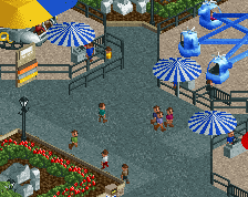
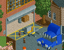
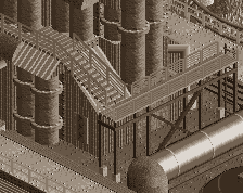
What you guys think, better now? I think so.
Attached Thumbnails
Maybe it's just me, but it feels a bit tiny, no?
The darked tarmac was a great tip from Louis. I'd expand the grass/foliage to one full tile and fill it even more with foliage.
Looks great now.
much better