Screenshot / Finna N. U. T.
-
 06-February 18
-
 CSO Adventure
-
 1 of 2
- Views 2,187
- Fans 1
- Comments 17
-
 Description
N - new
U - screen
T - every 3 months
Made on alex's classic bench.
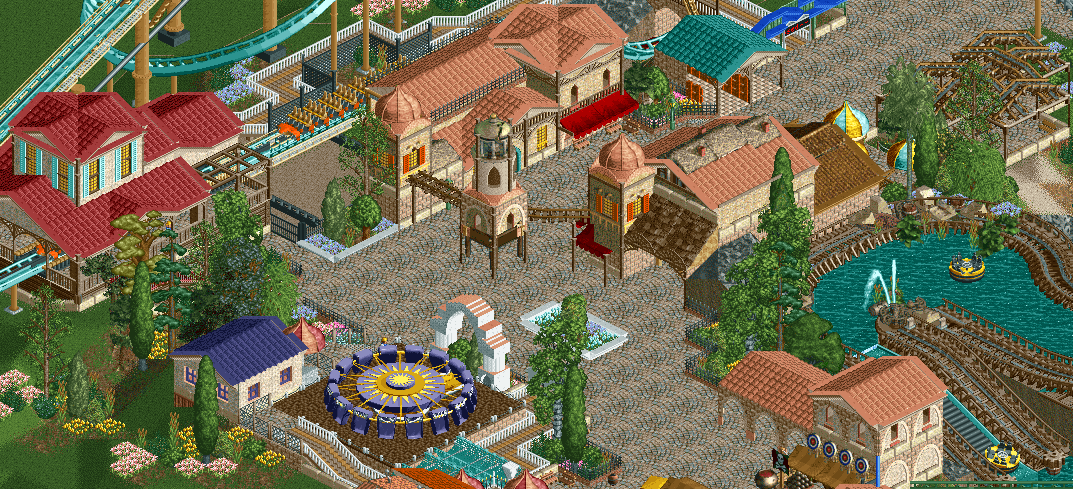
In all seriousness, I wanted this park to be a surprise for the NE Awards and upcoming H2H competition, but college has seriously delayed my progress, so here's part of what I have so far. -
 Full-Size
-
1 fan
 Fans of this screenshot
-
 Tags
Tags
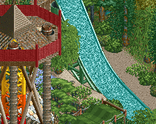
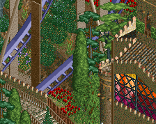
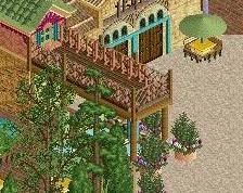
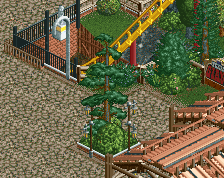
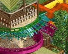
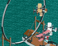
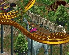
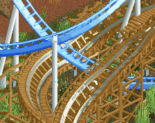
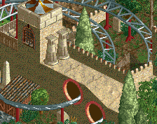
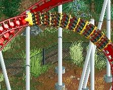
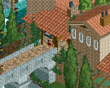
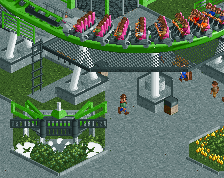
Aannnd. I'm missing walls.
Pretend you see this instead.
https://imgur.com/CrqTenp
Love the little path covers there. Great atmosphere!
The top half looks very nice, the bottom half (specifically the Chaos) kinda strays a bit into simplistic and less fitting architecture. It almost seems a bit unfinished. The rapids looks nice.
Very nice!
I love it! Nice coaster colors.
id get rid of the thatched houses in the roof, they aren't really adding anything. everything else looks snazzy! keep up the good work!
Path is way too busy, simply your texture choice, especially when it comes to roofs like Liam said. Some nice stuff but ultimately a bit messy and feels like you're a bit overwhelmed with the object selection.
Good step forward in your CSO work.
Looking cozy and warm, has a great old school vibe to it. But I agree with Liam, get rid of the unnecessary track.
your best work
This is a really nice start, but it needs peeps and more finish (lamps, benches etc) and perhaps a little variation to the paths (maybe another planter or two).
Not sure about the red roof for the station, I'd use the same colour to tie the area together better. Aside from that, really, really good start here!
One can definitely see that you are playing a lot NCSO, those medival houses and the trackitecture doesn't work for me, otherwise great stuff! I really like your color choices and the station building!
The trackitecture that goes across from one building to the centrepiece, to the other building, I'd keep. I agree with most others that the rest could be replaced with non-trackitectural forms.
You've got nice work here. Keep it up! (or maybe not, since it'll be three months till we hear from you).