Screenshot / Naga
-
 03-February 18
-
 Seas of Antiquity
-

 6 of 14
- Views 2,917
- Fans 1
- Comments 29
-
 Description
Half cobra, half man. The divine have taken over at Seas of antiquity.Feel the spirit inside of you when you embark on this suspended coaster the whole family can enjoy.
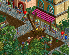
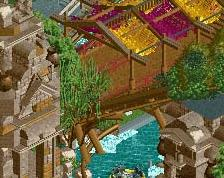
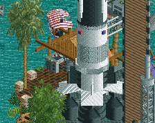
This is the first "real" screen of this park, and this is the first practically finished screenshot. Take the ones previous to this as a rough draft. -
 Full-Size
-
1 fan
 Fans of this screenshot
-
 Tags
Tags
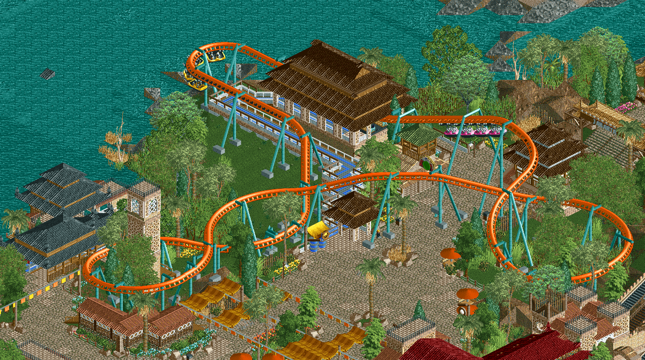
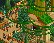
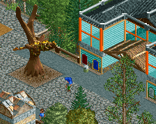
See if you can fix the glitching next to the queue. Other than that, peeps would help this out a lot. Arrow trains are a nice change.
wheres it glitching @ i dont see it
Probably the most atmospheric screen/area you've ever done and I love it.
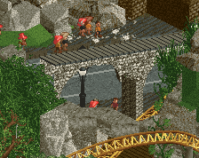
Oh, those are arches. My mistake.
Looks really good but as others have already said, really short. Works for a Vekoma family inverted, though, but in that case I agree the floorless trains would fit better. Nice atmosphere here, looks curiously old school and modern at the same time.
size doesn't matter
I was going to agree with RWE and say that I don't quite understand some of your choices in terms of textures and colors, but I don't think I will because his comment got ripped to shreds. Just because you believe this is some of your highest quality work doesn't mean everyone will agree with you.
You're one of the best builders on this site. Just remember that humility never goes out of style.
"I was going to agree with RWE and say that I don't quite understand some of your choices in terms of textures and colors, but I don't think I will because his comment got ripped to shreds. Just because you believe this is some of your highest quality work doesn't mean everyone will agree with you.
You're one of the best builders on this site. Just remember that humility never goes out of style."
hi thanks for the constructive criticism im very thankful
Welp I tried. Here's some constructive criticism.
I love the foliage choices, especially along the water's edge. I'm also a fan of the tan awnings near the bottom of the screen. I am not as much a fan of the aqua colored supports on a ride so close to water, they blend in and don't quite pop as much as they could. I'm also not sure on what the theme is; is it Asian, tropical, or somewhere in between?
first of all hi second of all i chose teal because i didn't want the ride to pop out too much, which could have easily happened with brighter support colors. it's already the focal point of the area and i have the trains which i can use for an extra boost of color. it's intentionally muted out.
also the theme is cambodian which doesn't mean shit besides an excuse to do both asian and tropical at the same time. taking themes too accurately leads to the liam syndrome where ur just remaking areas irl than how they'd look in a park.