Screenshot / Naga
-
 03-February 18
-
 Seas of Antiquity
-

 6 of 14
- Views 2,917
- Fans 1
- Comments 29
-
 Description
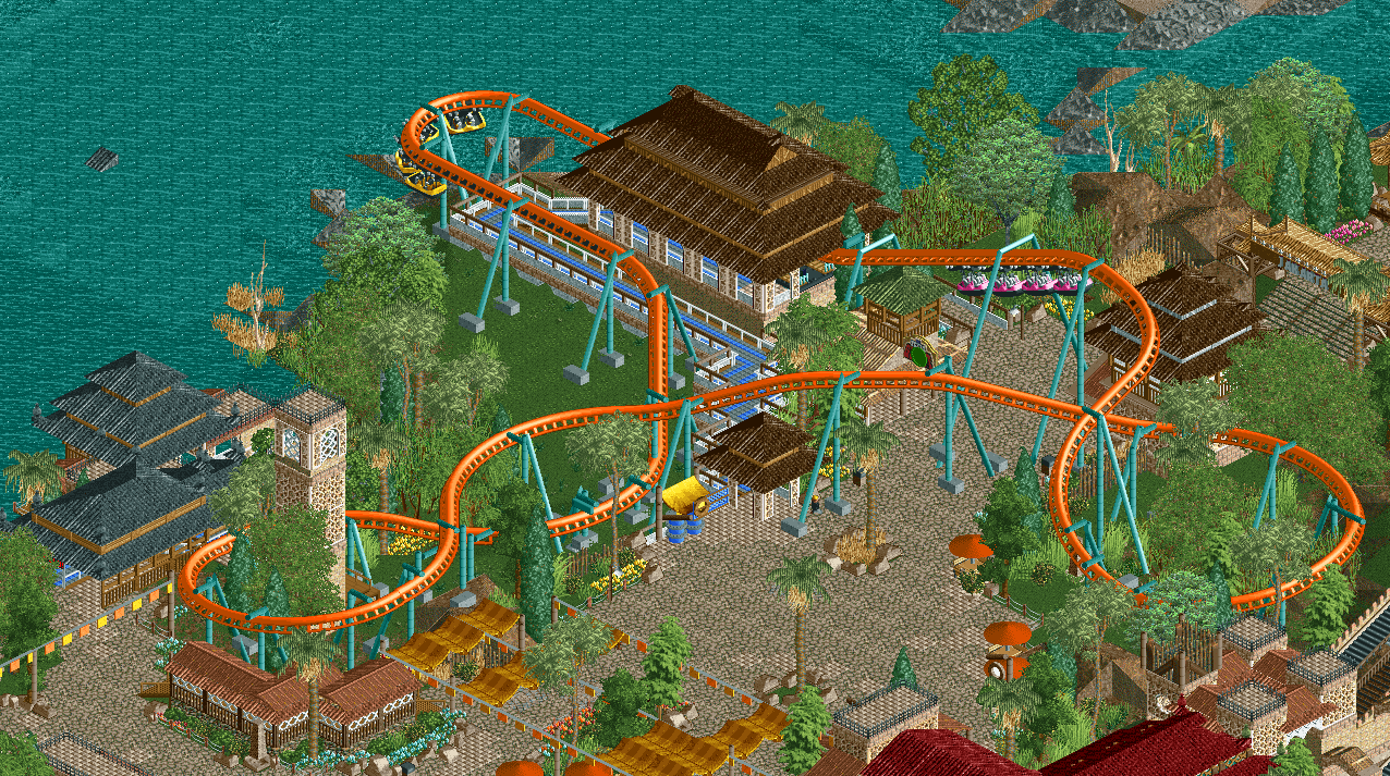
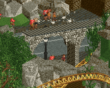
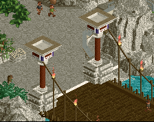
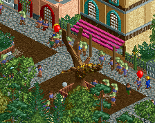
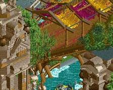
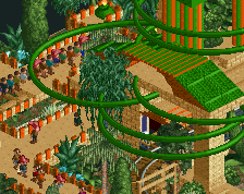
Half cobra, half man. The divine have taken over at Seas of antiquity.Feel the spirit inside of you when you embark on this suspended coaster the whole family can enjoy.
This is the first "real" screen of this park, and this is the first practically finished screenshot. Take the ones previous to this as a rough draft. -
 Full-Size
-
1 fan
 Fans of this screenshot
-
 Tags
Tags

it feels pretty short but i like it
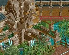
Lovely and a wonderful atmosphere. Get rid of the random floating roof in the water (lolz).
Interesting coaster. Feels like it'd fit a vekoma family invert more, but I like the idea of a small-train swinger.
Very nice!
I agree with Sammy; this feels rather short, but I like everything else here. Keep it up!
Thanks guys. The ride is intentionally short as i needed something to fill that sort-of-awkward space between the log flume and the transition into Jakarta, plus I thought it worked well as a family ride to be that short.
Sort of surprised that the score is relatively low- even with two votes- as this is probably my favorite stuff done, potentially ever.
Tell me what you guys want to see next and I'll probably get it out by next week.
wonderful color choices
Everything is great, things I would change to make it better:
Lift supports - too flimsy atm, possibly put a catwalk in too but that isnt a major flaw.
Trains - I think the floorless swinging trains would suit it better, especially with the smaller layout.
Great stuff though, I haven't been as keen on the Asian area as much as the other ones, but this is better now.
Screen with a lot of atmosphere to it. I also think the coaster lay-out is a bit short, I think an extra helix could do.
Wtf is that random piece of roof on the water
0% for littering the sea
63 percent?
This almost feels like it comes out of the same universe as Veteris Shores. I really like the atosphere here, although I'm not a fan of the texture on the tower on the left of the screen. I appreciate you using different and unique objects, but on that specific building it doesn't work IMO. The coaster itself looks great even though it's a bit short.
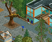
I don't get this screen. It is definitely atmospheric work, but then again the blue queue looks really akward for me. I've also seen the architecture done much better by you, it just feels like you randomly mixed interesting object textures that aren't used very often, but that doesn't make the whole thing working for me. Same goes for the foliage.
All in all still not bad, but probably not the Quality people would expect from you, which might explain the low voting.
Definitely use the floorless trains.
yeah i know theyre more realistic for the model and i'll go back to them, i just love the arrow trains lol
Default queue is literally the worst thing ever
you're literally the worst thing ever.