Screenshot / Steel Street
-
 31-December 17
-
 Bethlehem Steelworks
-
 1 of 10
- Views 1,959
- Fans 2
- Comments 13
-
 Description
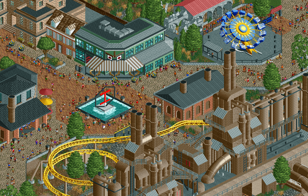
Introducing my new solo park project: Bethlehem Steelworks.
This park will be based on an alternate history of the development of the now-defunct flagship steel plant of Bethlehem Steel. In this "universe" the grounds were developed into a steel-themed amusement park.
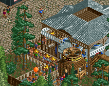
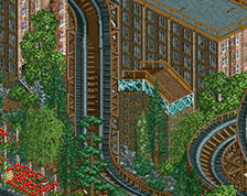
Shown in the screenshot is a portion of Steel Street, where souvenirs and nice meals are available, standing in the shadow of the old blast furnaces. -
 Full-Size
-
2 fans
 Fans of this screenshot
-
 Tags
Tags
do the meals consist of steak cooked Pittsburgh rare?
Is that building a replica steel plant, or is it meant to be the original? Because the original looks a little larger:
Also, nice job with the Bethlehem Steel logo. I thought it was just some design at first, but that was is the real thing. From Knoebels and now this, it seems like you are into making parks that require people to research to appreciate.
This looks great. I am looking forward to this project!
Spacek, the Bethlehem Steel logo will be in the park logo somehow, so it hopefully won’t require much research. I’m putting a lot of history and nerdy shit in this park for myself, but I’m going to make sure it’s still a park that can be enjoyed by all. Also, I know the furnaces are a bit smaller than IRL, that’s intentional as I don’t want them to completely dominate the whole map.
Iron Rattler, cool to know. I went to school in the area and my engineering degree makes me very interested in Bethlehem Steel. I thought it would be a neat project to bring together my love of the area and RCT.
I love anything that's industrial themed, so I dig this. Can't wait to see more.
Looks nice. Noticeable improvement over Knoebel's already. Some colour, theming and thoughtfulness instead of just execution.
Looking forward to seeing this progress.
Agree with posix. Already shows that you can do really good stuff without being tied down with simplistic architecture.
I'd dump the brick path and replace the black on the brick with actual trim.
Would it be better to replace the crazy paving with something less busy? I was already thinking about that. I’d like to keep the brick if possible, since there are a lot of brick/cobblestone paths in the real life area.
It's lacking that level of depth that kept Knoebels from a gold. Some things are very nice, but think more closely about the textures you use (the steel mill could be a lot more textually rich (look at Pierrot's factory screen), while the path is too textured- this makes the focal point of the screen end up being the ugly mix of that brick and crazy path). I would definitely redo the fencing as well; the brick berms aren't working.
I agree that you should have another look onto the path textures. Try to choose a texture that doesn't distract the view of the buildings and is darker, to get a better atmosphere.
Otherwise great stuff, looking forward to see where this will go.