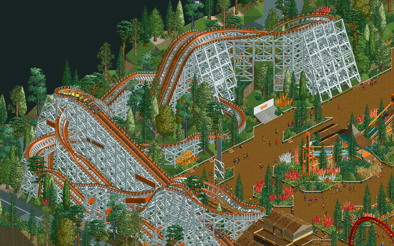
Screenshot / #fbf - El Grande
-
 22-December 17
- Views 1,318
- Fans 0
- Comments 4
-
 Description
I can't believe that this screen is ten months and a bit old. This is what I consider to be the first screen that got me a little bit more than just 'another builder.'
Ten months ago, I thought this was great, but now seeing this screen, I am almost disgusted, in a pleasant way.
#fbf on something that isn't that great? Yeah, I just went there. -
 Full-Size
-
 No fans of this screenshot
-
 Tags
Tags
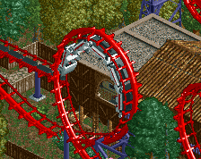
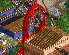
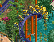
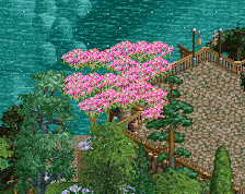
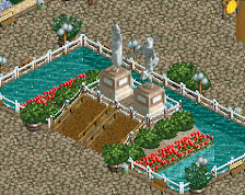
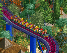
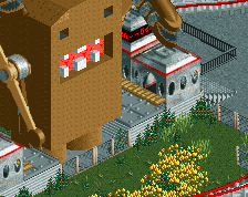
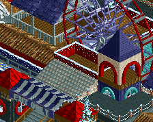
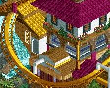
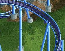
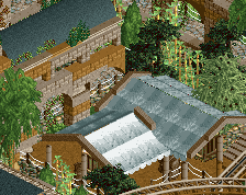
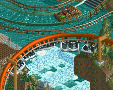
Fear not, El Grande has not whisked away into the depths of unfinishedness. It's still here, but I am focusing more on Paradiso Medievale than Redlynch Heights.
Here is what El Grande looks like now:
Once I am finished with Paradiso and have released it, I'll resume work on Redlynch Heights and other projects. Fear not! Enjoy this flashback for as long as it shall live.
i loved the coaster when you posted the original screen, the bold color scheme exaggerated certain elements. but the archy in the new version is FRESH
Honestly I like the old one better. The old version has better colors and feels much more lively with its foliage, peeps, and path widths. The new version feels like Brown And Blocky: The Park.
Nice but I agree with spacek, I think I prefered the first one.