Screenshot / #FBF/World's Fair
-
 21-December 17
- Views 3,605
- Fans 1
- Comments 25
-
 Description
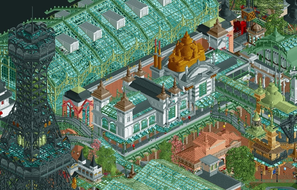
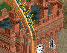
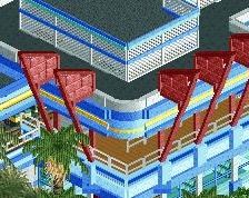
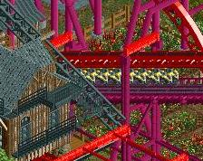
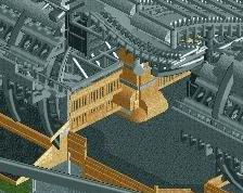
Flashback to my Head2Head 7 R2-losing park, World's Fair. Meant to be a realistic, if fantastical, take on a turn-of-the-century French world's fair, the park features smaller international pavilions and larger glass pavilions focusing on scientific, technological, and cultural advances. I still love the concept and may look into revisiting the park with a better, more organized map.
-
 Full-Size
-
1 fan
 Fans of this screenshot
-
 Tags
Tags
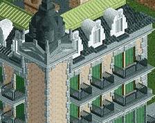
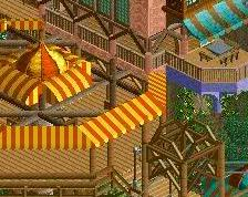
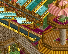
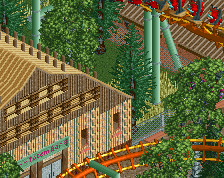
the glass halls are perfect
I think our park only one because it was clearly finished, and it was a little more readable. the finished work here is no question better quality than anything in bermuda. the map composure suffers though, and as a whole it becomes difficult to work out what is going on, which is not helped by being unfinished. its unfortunate, because much of this park is some of the best rct2 that was ever made. This screen in particular is astounding, although the ground level mostly sucks compositionally. removing some of the huge trees and creating a more open plaza vibe would have helped dramatically. I'll still be proud to have led a park that beat robbie though, even if its a cheap win
I think the builders should have remembered, that complexity isn't everything. For me, this is the equivalent of a progressive band, that just builds in as much technical stuff as possible but doesn't think about, if the result will end up sounding good.
You can say whatever you want about this, but it's still an incredible piece of work and talent. To be honest, I don't like that Eiffel (?) tower, it would have been better without it in my opinion. Archy is fabulous.
Oh wow, I totally forgot I posted this hah.
Thanks for the feedback, guys. I'll totally take the fall for the complexity of this park, as the idea of a super-dense, fantastical, bewildering World's Fair was something I was really keen on doing. I think what ended up escaping me is that complexity works well with contradiction, or that busyness is best punctuated with calm. Super-successful dense parks work because their components are clear and legible; likewise, complex full-scale parks balance out complex micro work with more open composition. This park tried to be complex from a macro standpoint and then even more dense and elaborate on a micro building-to-building level. I bit off more than I could chew with the concept and wasn't able to finish it.
That being said, I still am quite proud of what we accomplished, and I think some of the stuff in this park I'd be happy to call my best work. Maybe someday I can comeback to this concept on a larger, more open scale, and give the concept and aesthetic the execution it deserves. Seph and Sey also did fantastic work on this, and I hope they don't feel like I screwed them over so much here hah.
The amount of time and commitment alone to make those structures, hats off to all who put in the work. I could never be on that level, I can't even finish a park *shrugs* lol