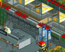
It's an interesting attempt, but your idea of "minimalism" is sort of plain and uninteresting. The really confusing part is the use of intricate detail in some parts adjacent to the intentionally undetailed buildings.
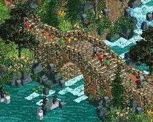
i can't tell what the purpose of any of the buildings is and the path/fence/sand combo all blends together and just becomes a sea of negative space. foliage is practically nonexistent
otherwise people are over-reacting. keep experimenting
Is this some kind of joke? As we all know you're capable of building so much better than this... You always were. The custom flat to the left of the screen is very nice, the rest is incredibly bland...
I'm with CC9. While this idea does seem really cool to me (even though I would never even dream of building like this), I think this work isn't quite committed to one specific level of minimalism or another. At a quick glance, the trackitecture roof of the coaster, the pirate ship and the coaster supports seem to be more complex and definition-rich than other stuff.
Keep this experiment going, though. I hope you'll find that perfect balance.
No this is something I've been working studiously lately, just wanted to try something new but it sounds like a big fail for everybody.
For some reasons, I'm really enjoying building this, it's maybe not on a pro level, but after all these complicated and overdetailed projects I've been working on lately, it's very relaxing and funny.
Anyways, thanks for the feedback guys, and if there's someone here who likes it, feel free to tell. :' )
I can appreciate it. It has it's charms because it's new and innovating. I really prefer 'normal' screens though. But it's great to see someone trying new things.
No this is something I've been working studiously lately, just wanted to try something new but it sounds like a big fail for everybody.
For some reasons, I'm really enjoying building this, it's maybe not on a pro level, but after all these complicated and overdetailed projects I've been working on lately, it's very relaxing and funny.
Anyways, thanks for the feedback guys, and if there's someone here who likes it, feel free to tell. :' )
Well I guess it's all good and well to try something different, and something simpler. What looks so weird to me is what you've chosen put effort into; those custom rides and maybe the the coaster station, while the (arguably) more fundamental aspects such as good ride design and proper foliage seem completly neglected (not to mention every building being a windowless box...). Anyway since you're happy about it who am I to complain! I hope this will refresh your inspiration, I'm looking forward to some more ambitious work from you!
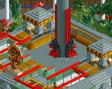
Well as long as you have fun, but just as Faas I find it quite terrible. The archy is blocky and misses a lot of details. Even the basic details like windows and doors aren't there.
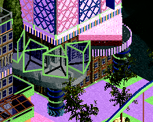
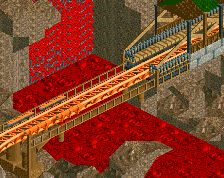
The tophat of the coaster seems too small compared to it's launch strip. And the supports are just awful. The little pirate ship is cute but it's envorinment kills it. The other flat ride could have potential but it executed too minimal.
I think it's nice... there's a lot missing though and just because it's minimalism doesn't mean it has to be repetitive... maybe add some variation, e.g. give some buildings sloped roofs instead of making them all flat. What is here is really clean though... reminds me of Parkitect.
 03-December 17
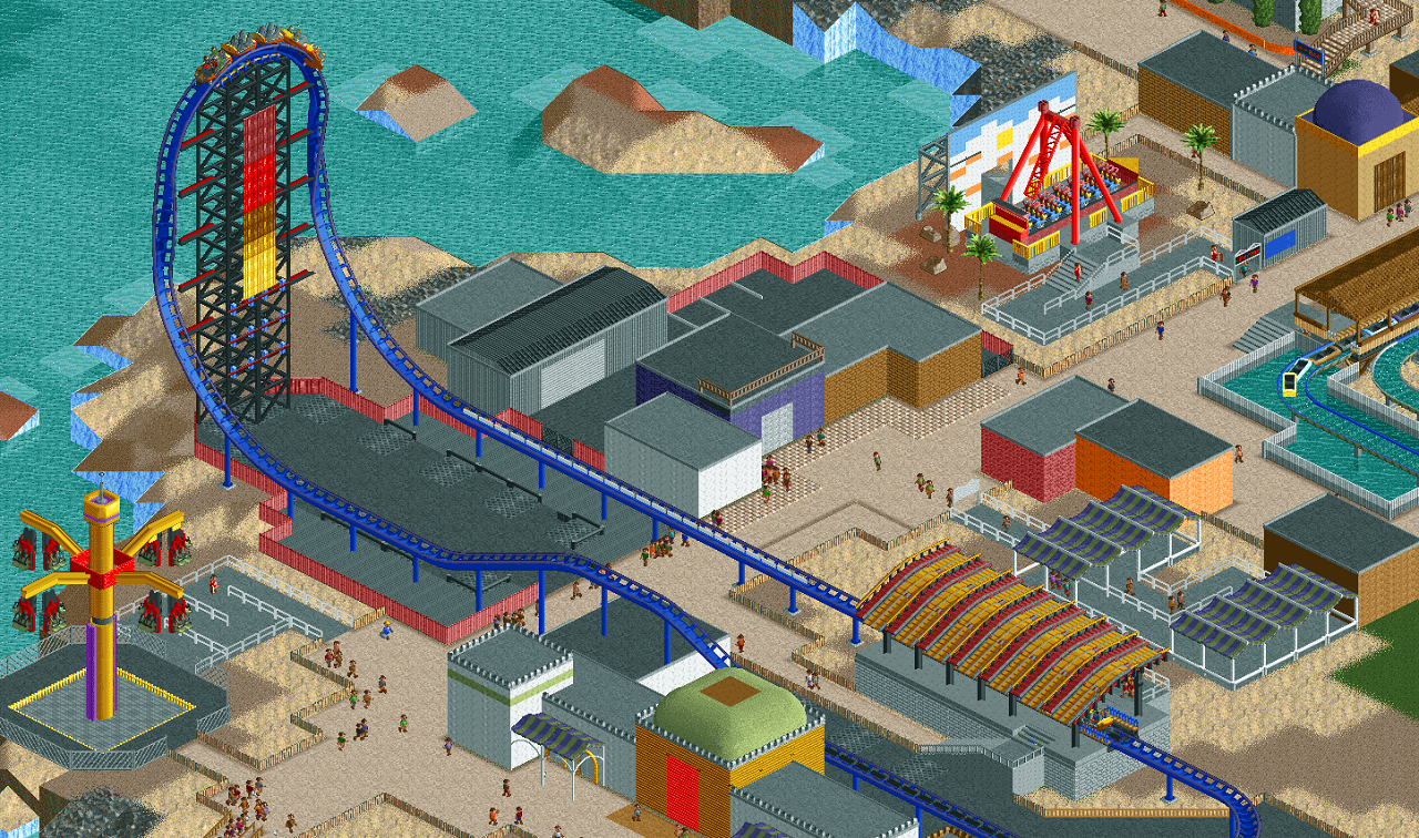
Some of the flats look cool but the rest is awful haha. Put those flats in better context and you'd have something special.
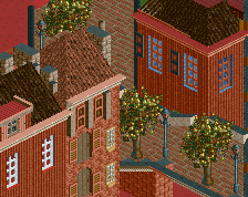
It really needs windows.
It's an interesting attempt, but your idea of "minimalism" is sort of plain and uninteresting. The really confusing part is the use of intricate detail in some parts adjacent to the intentionally undetailed buildings.
haha this is weird
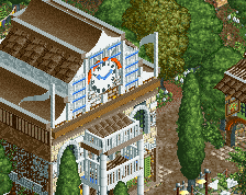
This is very un-Julow. The only part I do like is the custom flat in the left hand corner.
i can't tell what the purpose of any of the buildings is and the path/fence/sand combo all blends together and just becomes a sea of negative space. foliage is practically nonexistent
otherwise people are over-reacting. keep experimenting
Is this some kind of joke? As we all know you're capable of building so much better than this... You always were. The custom flat to the left of the screen is very nice, the rest is incredibly bland...
I'm with CC9. While this idea does seem really cool to me (even though I would never even dream of building like this), I think this work isn't quite committed to one specific level of minimalism or another. At a quick glance, the trackitecture roof of the coaster, the pirate ship and the coaster supports seem to be more complex and definition-rich than other stuff.
Keep this experiment going, though. I hope you'll find that perfect balance.
Haha I wish it was...
No this is something I've been working studiously lately, just wanted to try something new but it sounds like a big fail for everybody.
For some reasons, I'm really enjoying building this, it's maybe not on a pro level, but after all these complicated and overdetailed projects I've been working on lately, it's very relaxing and funny.
Anyways, thanks for the feedback guys, and if there's someone here who likes it, feel free to tell. :' )
Everything feels to flat and one-dimensional. I'm not a fan of this minimalist style, it just doesn't work for me.
I can appreciate it. It has it's charms because it's new and innovating. I really prefer 'normal' screens though. But it's great to see someone trying new things.
I like that you're trying new things, but this super minimalism approach is absolutely not working for me, sadly.
Good effort, at least, what there is of it.
Well I guess it's all good and well to try something different, and something simpler. What looks so weird to me is what you've chosen put effort into; those custom rides and maybe the the coaster station, while the (arguably) more fundamental aspects such as good ride design and proper foliage seem completly neglected (not to mention every building being a windowless box...). Anyway since you're happy about it who am I to complain! I hope this will refresh your inspiration, I'm looking forward to some more ambitious work from you!
Well as long as you have fun, but just as Faas I find it quite terrible. The archy is blocky and misses a lot of details. Even the basic details like windows and doors aren't there.
The tophat of the coaster seems too small compared to it's launch strip. And the supports are just awful. The little pirate ship is cute but it's envorinment kills it. The other flat ride could have potential but it executed too minimal.
Sorry Julow.
I think it's nice... there's a lot missing though and just because it's minimalism doesn't mean it has to be repetitive... maybe add some variation, e.g. give some buildings sloped roofs instead of making them all flat. What is here is really clean though... reminds me of Parkitect.
What is this site's obsession with tiny ass rocket coasters? lol
Anyway, it's weird but I like it. Add some windows though.